- Thu 05 April 2012
- Cartographica
- Rick Jones
- #analysis, #kernel density, #tornado, #weather
We have done a lot of posts about tornado activity in the past on this blog. This is largely due to the interesting data that are openly available as well as the awesome power that tornadoes contain, which naturally makes them interesting. The recent tornado activity in Indiana and Kentucky and then Monday's dramatic daytime tornado that ripped through through the Dallas area has again brought my attention back to tornadoes.
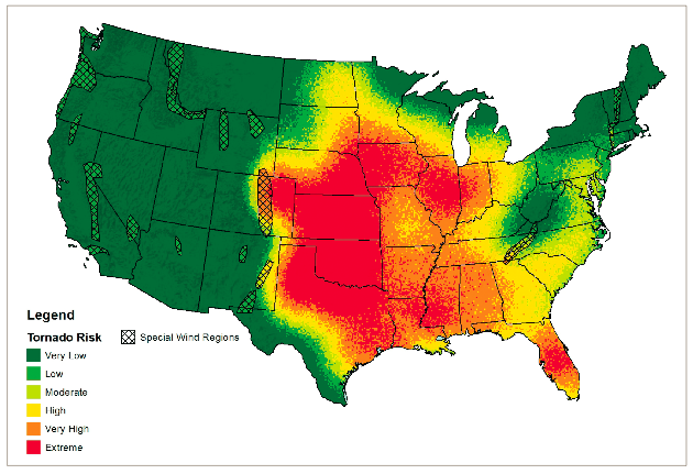
Recently Core Logic produced an interesting study on tornado and hail damage throughout the United States. Get the article here The report looks at similar data that we have used in other posts on tornadoes and the tornado maps look strikingly similar to the ones that we have produced using Cartographica. The Core Logic article is very interesting as it describes the growing tornado threat in the U.S. and it provides interesting maps along with some spatial analysis. These types of analyses are important because insurance agencies can use the conclusions to determine pricing for home owner insurance. One interesting finding of the study was that the traditional area known as tornado alley, which we have mapped in a previous post, is not the only place where people and property are at risk of tornado damage. The study finds that, "of the top ten states with the highest number of tornado touchdowns, only three fall within Tornado Alley." This goes against the popular understanding that most tornadoes happen in the breadbasket states.
Based on available weather data Core Logic also developed "modeling techniques to project the probability of a tornado or hail events for states and local core-based statistical areas across the U.S. Their study provides maps of the risk for damage from these types of storms. The map from the Core Logic study was produced using wind and hail probability layers that are combined to create risk probabilities. The article also provides local area risk maps for several states. Here is a snapshot of Core Logic's map.
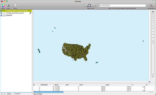
We can create similar maps using Cartographica. Using data from the National Oceanic and Atmospheric Administration's website. Download the 1950-2006 tornado touchdown points and then import them into Cartographica by choosing File > Import Vector Data. Notice that the points are in all fifty states, Puerto Rico and American Samoa. To make our map similar to the Core Logic Map we need to select the tornadoes only in the lower 48 states by using the identify tool. Select the points within the lower 48 states by dragging a box around them, and then choose Layer > Create Layer from Selection. This will automatically add a new layer to the layer stack that contains only the tornadoes in the lower 48 states. I provide an image below of the new layer. Notice the blue points outside of the lower 48 tornadoes. These are blue because the new tornado selection layer does not include these points, and therefore the points in the layer under the tornadoes selection layer are still visible. Once finished remove the original tornadoes layer by clicking on the - button at the bottom of the layer stack.
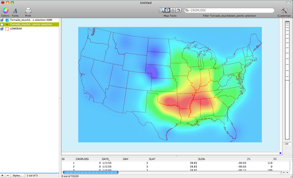
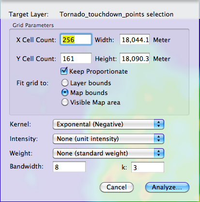
Now, we can create a similar map to the one found in the Core Logic report. I should admit that our map does not combine multiple layers to create a risk map, but it does combine more than 50 years of tornado data into a pooled sample that allows us to create a historic heat map that shows the concentration of recorded tornadoes over the last half century. This map does not combine multiple variables to determine risk, but does show the spatial distribution of recorded tornadoes. Its plausible that such a large sample size over a long period of time may produce fairly accurate estimates about risk of tornado exposure at the present time. Its at least a decent guess. We can create our version of the risk map by holding down the option key and choosing Tools > Create Kernel Density Map… Next, you can determine the type of kernel you would like to use and whether you would like to weight the cells by another variable. I first used an exponential kernel with no weight to create the map. I provide an image of the Kernel Density window to show the set up. Also I provide an image of the KDM that this set up create as well.
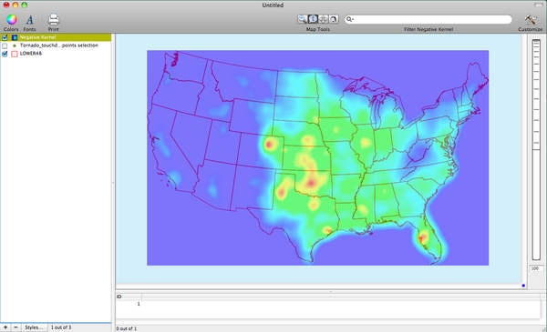
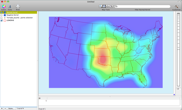
The KDM made with an exponential kernel shows where high concentrations of tornadoes are located. The red areas are at the highest risk. Yellow and Green are slightly lower risk than the red areas. We can create a map with different output by changing the kernel. For the second map I used a normal kernel to create the KDM. I provide an image below of the results.
The next map shows a map made with a normal kernel and I also weighted the KDM by the F-Scale variable, which is a measure of tornado intensity. Notice that the areas at most risk of high intensity tornado activity are located in several southern states of the U.S. like Arkansas, Louisiana, Tennessee, Mississippi, and Alabama. This finding of risk outside of Tornado Alley is similar to Core Logic's finding in their report on tornado risk.