- Thu 24 June 2010
- Cartographica
- Rick Jones
We are now nearly a month into this years hurricane season, which ranges from the first of June until the end of November. Hurricanes are extremely large, wide-spread storms that are naturally difficult to study. GIS has been used for a long time to track, monitor, and measure the effects of hurricanes. Recently I found a data set on the National Atlas website that has data for historic hurricanes from 1851-2004.
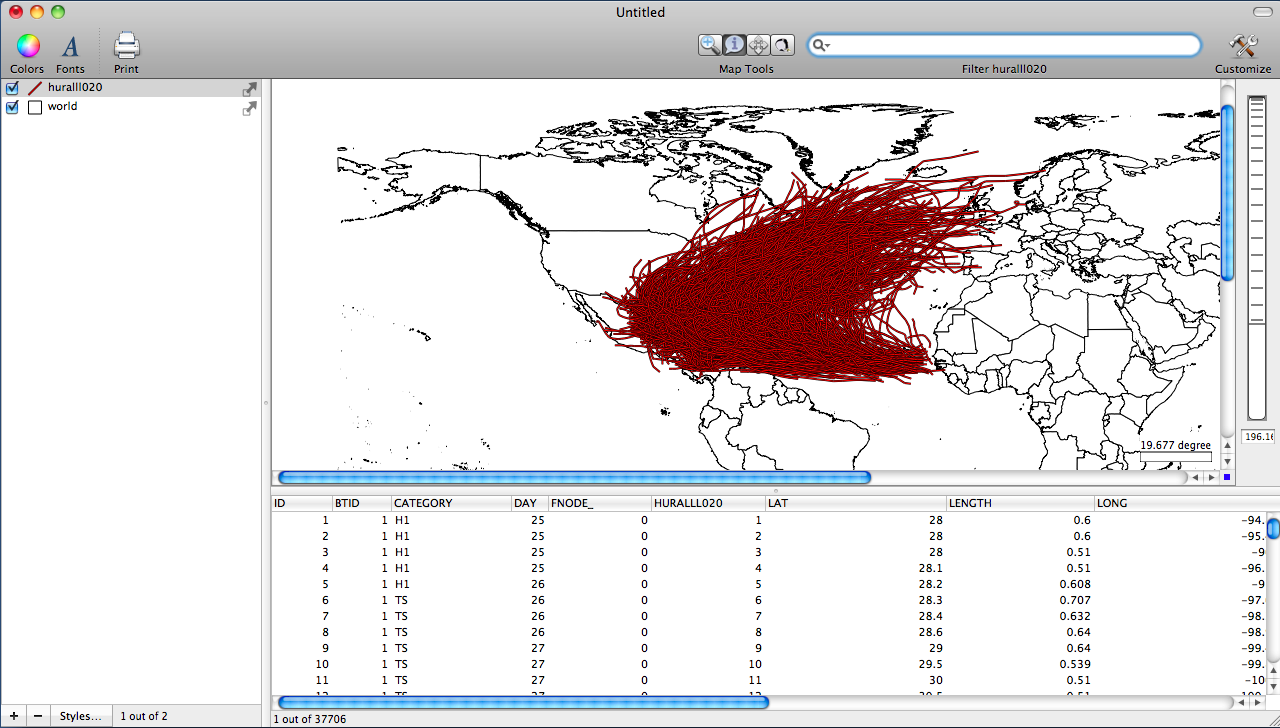
The first screenshot shows the entire data set added to a map. Notice that there are over 30000 segments in the file. Joined to each segment are a number of variable fields that each contain information about the hurricane. Included in the variable fields are information about the strength of the storm, the storms name, it length, and many others.
The First map shows all of the hurricanes in the data set added to the map.
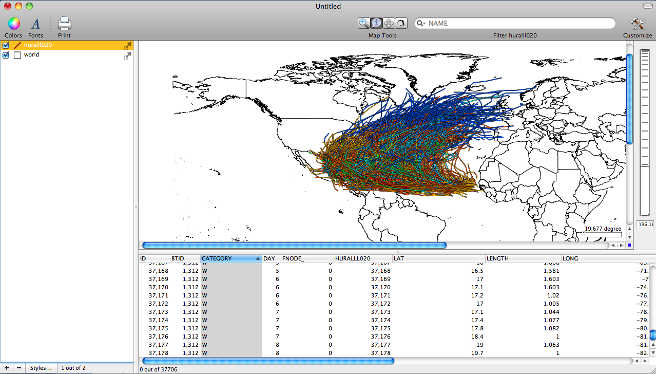
The Second map shows the classifications of the hurricanes according to the Saffir-Simpson scale. For more information on the Saffir-Simpson scale check out Wikipedia. In order to shows the different scales Each scale was given a different color in the layer styles window.
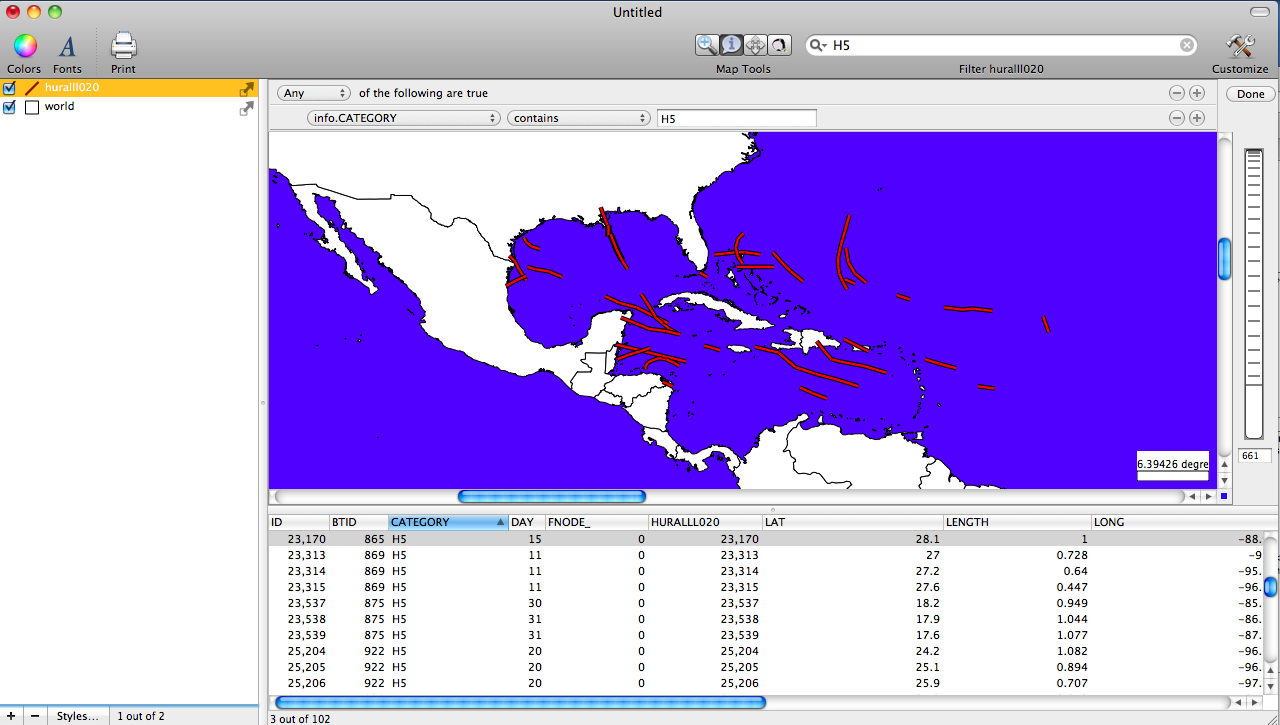
The third map shows only Category 5 hurricanes which are the strongest hurricanes and are defined as having winds greater than 135 miles per hour.
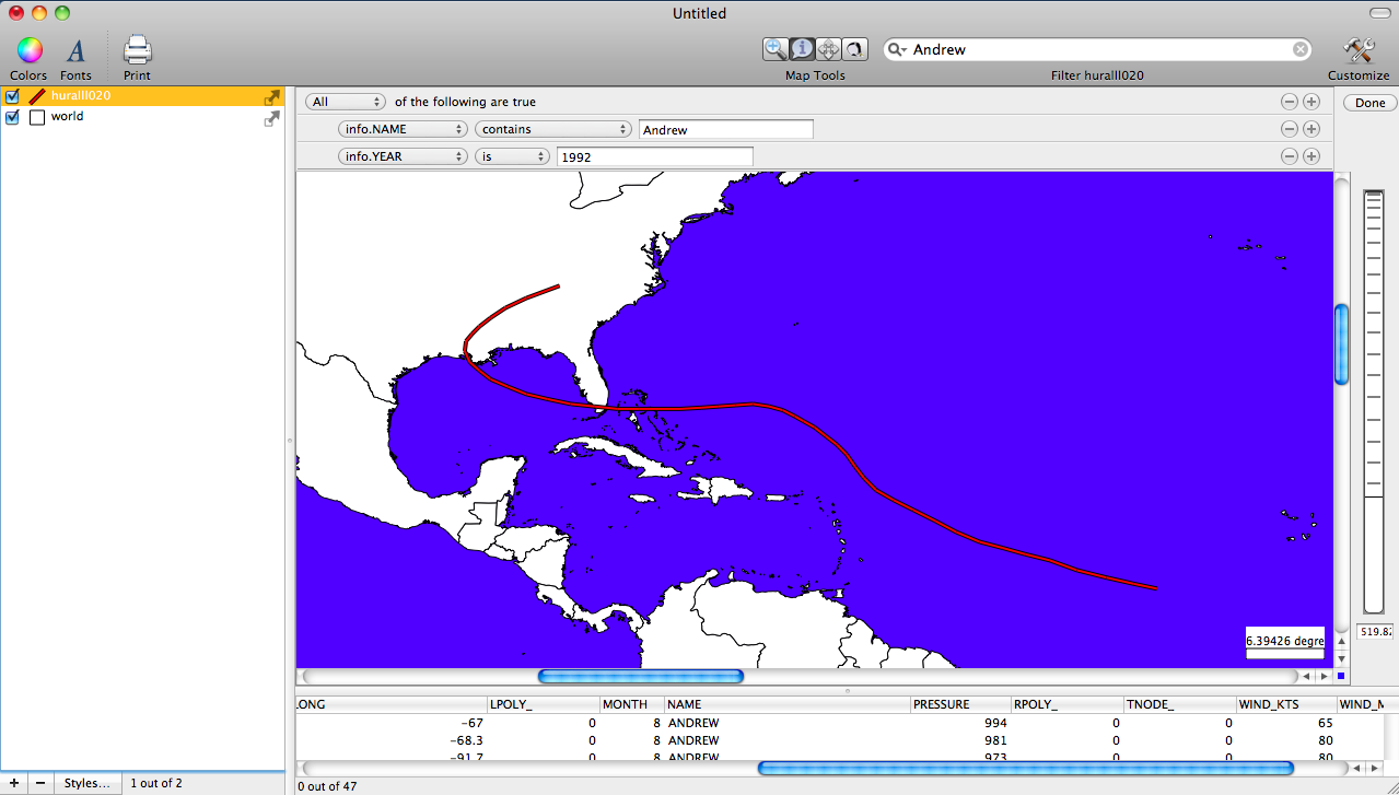
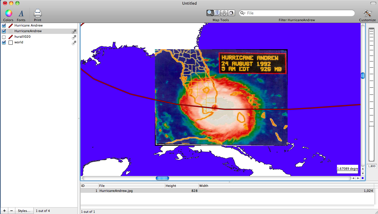
The fourth Map shows the very infamous hurricane Andrew, which occurred in 1992 and caused record setting levels of damage. Notice the search terms entered into the filter bar to select only hurricane Andrew from the data set.
The final image shows an overlayed image of the hurricane when it was at its strongest as it made landfall near Miami Florida.
