- Tue 29 June 2010
- Cartographica
- Rick Jones
The field of public health is one that has benefited greatly from technology related to GIS. A very famous early example of use of maps to combat a public health problem is when John Snow mapped the outbreak of Cholera in England during the 1850's. The ideas used by John Snow have been greatly enhanced in the nearly two hundred years since his innovative use of maps. In this post data Public Health data on Cancer in the United States is mapped using Cartographica.
The public health data used in this post were collected from National Atlas1, which has numerous data sets for national level data in the U.S.
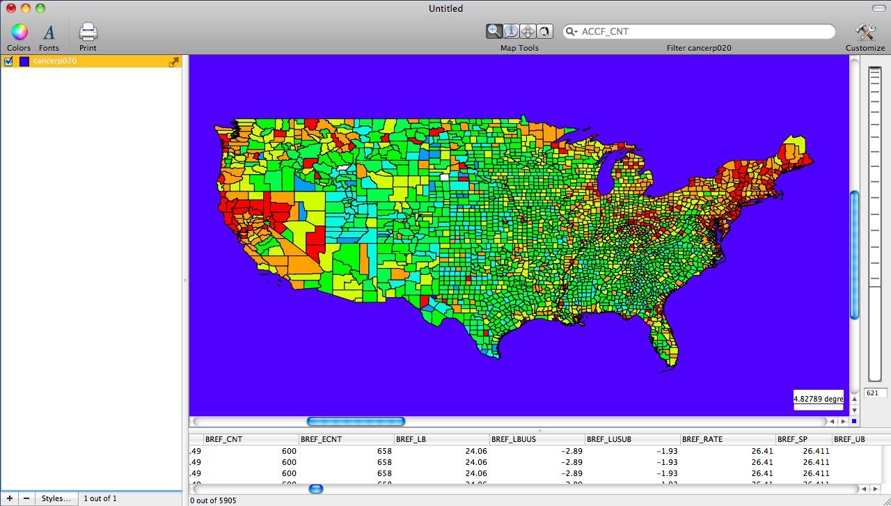
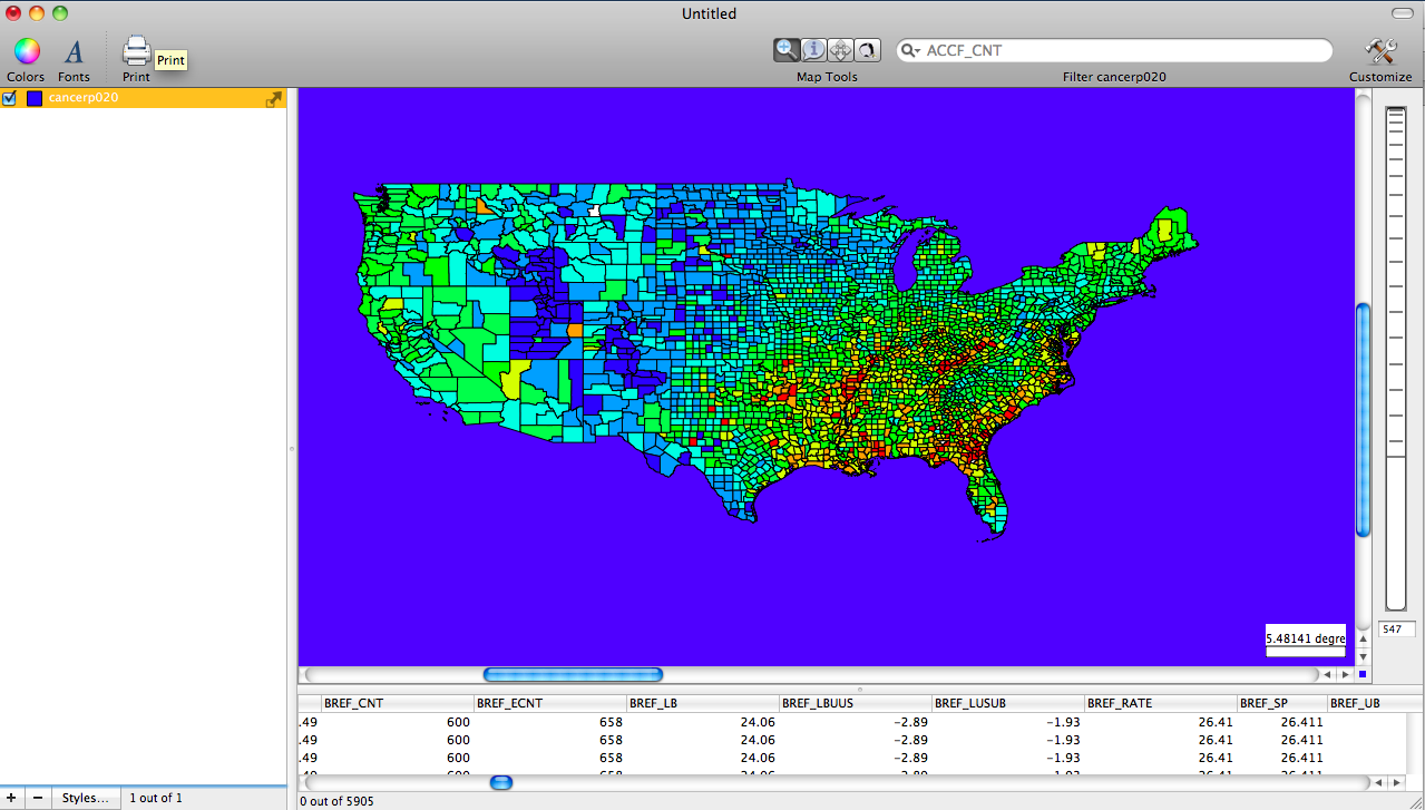
The first map displayed shows the rate of all cancers mapped by country in the U.S. Based on the map it appears that the Northeast and the West Coast have the highest rates of cancer
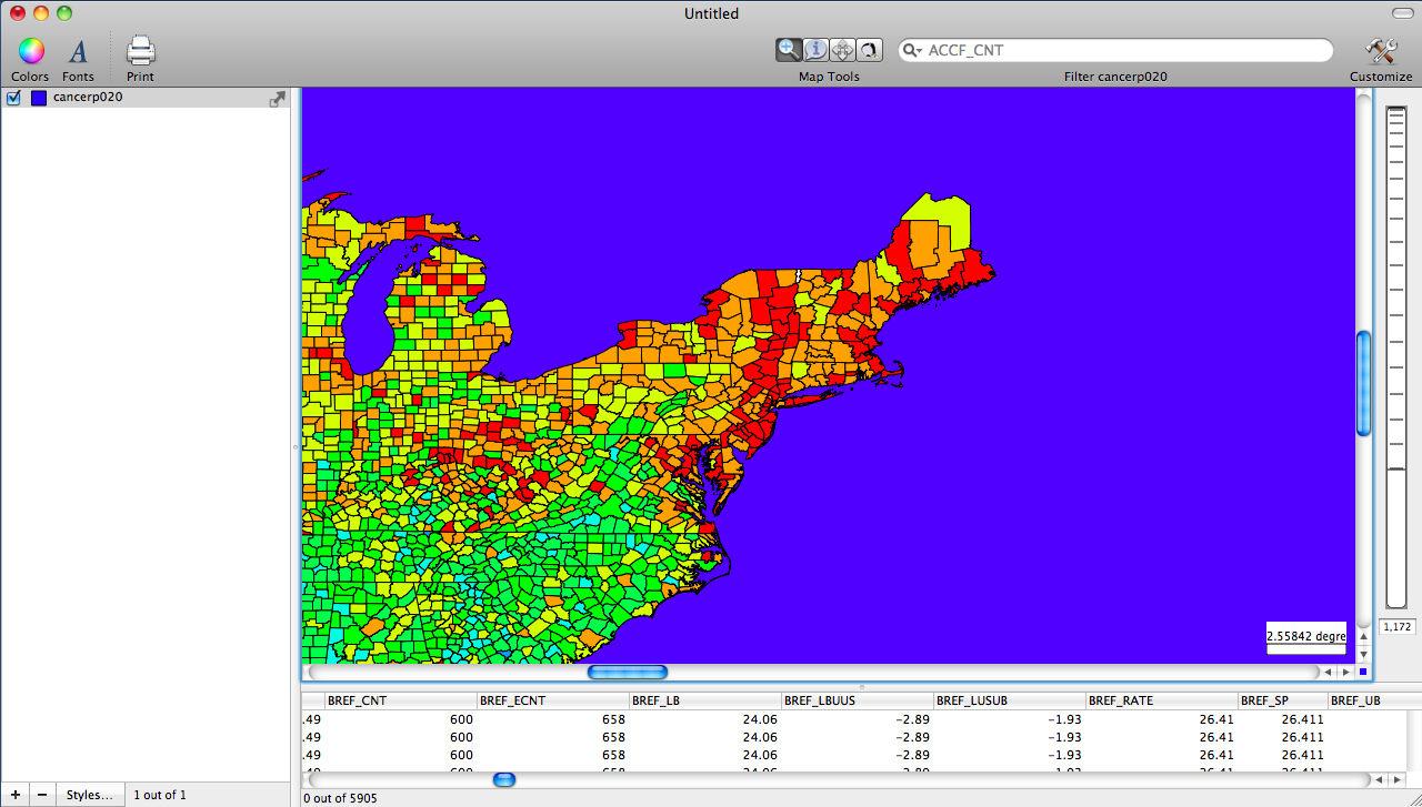
The second map is a zoomed in look at the Northeast.
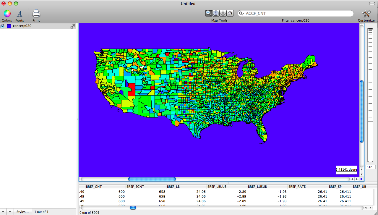
The third map shows the rates of breast cancer across the U.S.
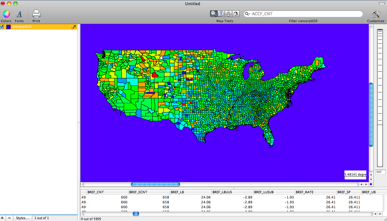
The next map shows the rates of prostate cancer across the U.S.
The final map shows rates lung cancer
-
The National Atlas program was halted, although health data, including maps, are available through the CDC's AtlasPlus program (https://www.cdc.gov/nchhstp/about/atlasplus.html) ↩