- Mon 16 August 2010
- Cartographica
- Rick Jones
Cartographica has added new classifications for displaying data. We have expanded the classifications from Equal Interval and Jenks classifications to Equal Count, Equal Area, Quartile Distributions, Quintile Distributions, and classification that incorporates all Unique Values. The upgrades in classifications schemes gives users better capability for displaying data using choropleth maps.
Data classifications are useful for representing continuous data in logically defined categories for use with choropleth mapping. The data classification methods for each have advantageous and disadvantages for representing data distributions. The different data classifications within Cartographica are described below with a basic discussion about what they do and how they are advantageous to the creation of choropleth maps.
Data Classification Types
Equal Interval Distribution: The range of data values are divided into intervals that are the same size. The advantage of the equal interval distribution is that it is unbiased in terms of category selection. Each category is given the same proportion of the range of values. The Equal interval classification creates choropleth maps that are good for showing the values that are either over or under represented. However, intervals that are over represented will result in choropleth maps that appear as mostly the same color. Data that are evenly distributed are well represented by Equal Interval Distributions.
Natural Breaks (Jenks) Distribution: The Jenks classification is designed to place variable values into naturally occurring data categories. Natural breaks in the data are identified by finding points that minimize within-class sum of squared differences, and maximizes between group sum of squared differences. Essentially, the Jenks method minimizes within class variances (makes them as similar as possible) and maximizes variance between groups (makes data classes as different as possible). The advantage of the Natural Breaks (Jenks) classification is that it identifies real classes within the data. This is useful because it creates choropleth maps that have accurate representations of trends in the data. The Jenks distribution is not well suited for data that have low variance.
Equal Count Distribution: The Equal Count distribution creates intervals so that each has an equal proportion of the sample. Equal Count is advantageous because each class will be equally represented on the choropleth map. In some cases the counts may be slightly unequal because sample sizes are uneven. Equal count is disadvantageous because it may group outliers in categories that are a poor representation of the actual distribution of the data.
Equal Area Distribution: The Equal Area classification creates data categories that each contain an equal proportion of the geographical area being examined. This is best suited for data with units of analysis that have relatively equal areas. When there are large differences in the area size of units of analysis the data categories will include an unequal proportion of the sample. In samples with units of analysis that have similar area sizes the map will have approximately equal representation from each data class.
Equal Quartile Distribution: The Equal Quartile data classification places 25% of the sample into each of four categories. This is advantageous because each category will be equally represented in the choropleth map. Also this is advantageous because it a geographic way of displaying data that are in each quarter of the data distribution. This makes for easy explanation when describing results. Equal quartile is disadvantageous because outliers may be lost in lower or upper 25% classification.
Equal Quintile Distribution: The Equal Quintile data classification places 20% of the sample into each of five categories. The advantages and disadvantages are similar to those of the Equal Quartile Distribution.
Unique Values Distribution: Creates a category for each unique value within a sample. This is best used when there are few unique values within a data set. Many unique values within a data set means that there will be less differentiation when a dataset is mapped, and thus, the Unique Values classification becomes less useful. Also, the Unique Values Distribution is best suited when data are presented at a level of high aggregation. For example, presenting data at the state level could only possibly yield 50 unique values. However, representing data at the county level could potentially result in 3,140 unique values.
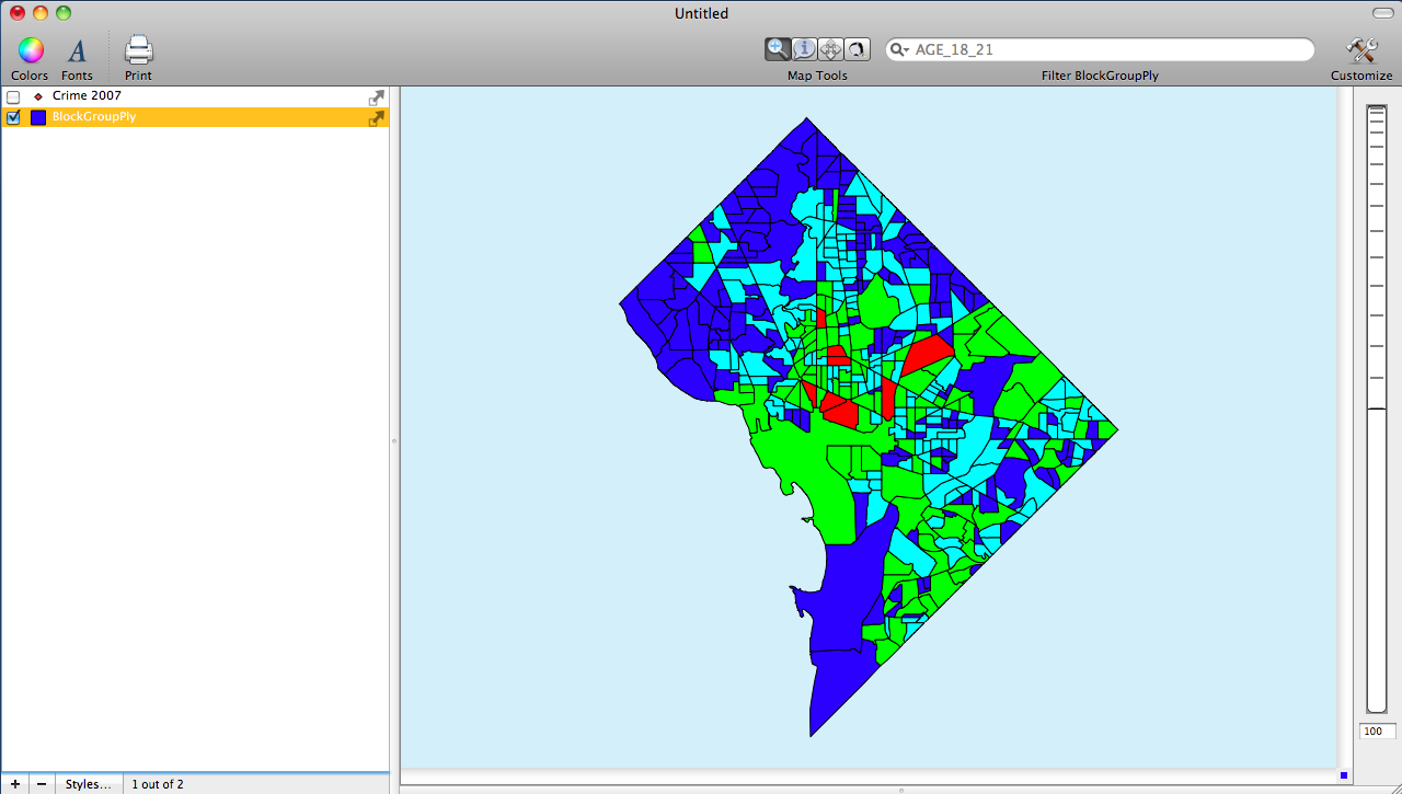
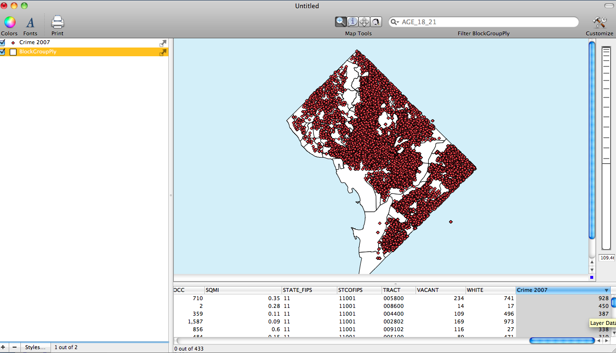
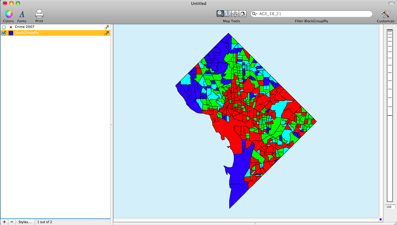
The screenshots below highlight where to find the different classifications schemes and shows a few different outputs. The data being displayed are counts of crimes in Washington D.C. block groups.
The first image shows the basemap of Washington D.C. with the Crimes for the year 2007 added. Also notice in the Data Viewer that there is a column labeled Crime 2007 which is a count of the crime in each block group. This was done by using Cartographica's Count Points in Polygons tool.
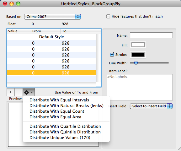
The second image shows the Layer Styles Window for the D.C. Block Group Layer. Notice that the based on menu has been set to the Crime 2007 data field. Also notice that six categories have been added. When the categories are first added they will range from the minimum to the maximum. Also notice that the Gear drop down menu is selected revealing all of the classifications schemes.
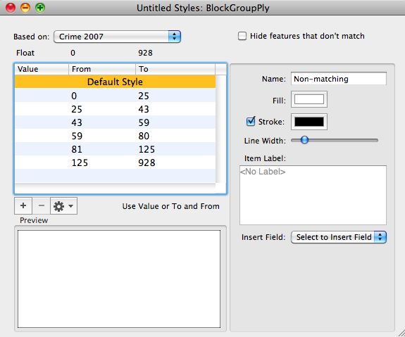
The third image shows the Layer Styles Window again except this time a classification has been used to redistribute the data across the six categories. The distribution shown uses the Equal Count classification. Notice that the number that were once from minimum to maximum are now define by the classification.
The fourth image shows the Choropleth map using the Equal Count Classification
The final image shows a comparison choropleth map using the Jenks distribution