- Sun 12 July 2020
- Featured Maps
- Gaige B. Paulsen
- #customer maps, #covid-19, #health
Today, I'm going to call attention to mapmaking by one of our Cartographica users, Stephen Taylor. You can see his Animation of Covid-19 New Cases, and updates to it on his YouTube Channel.
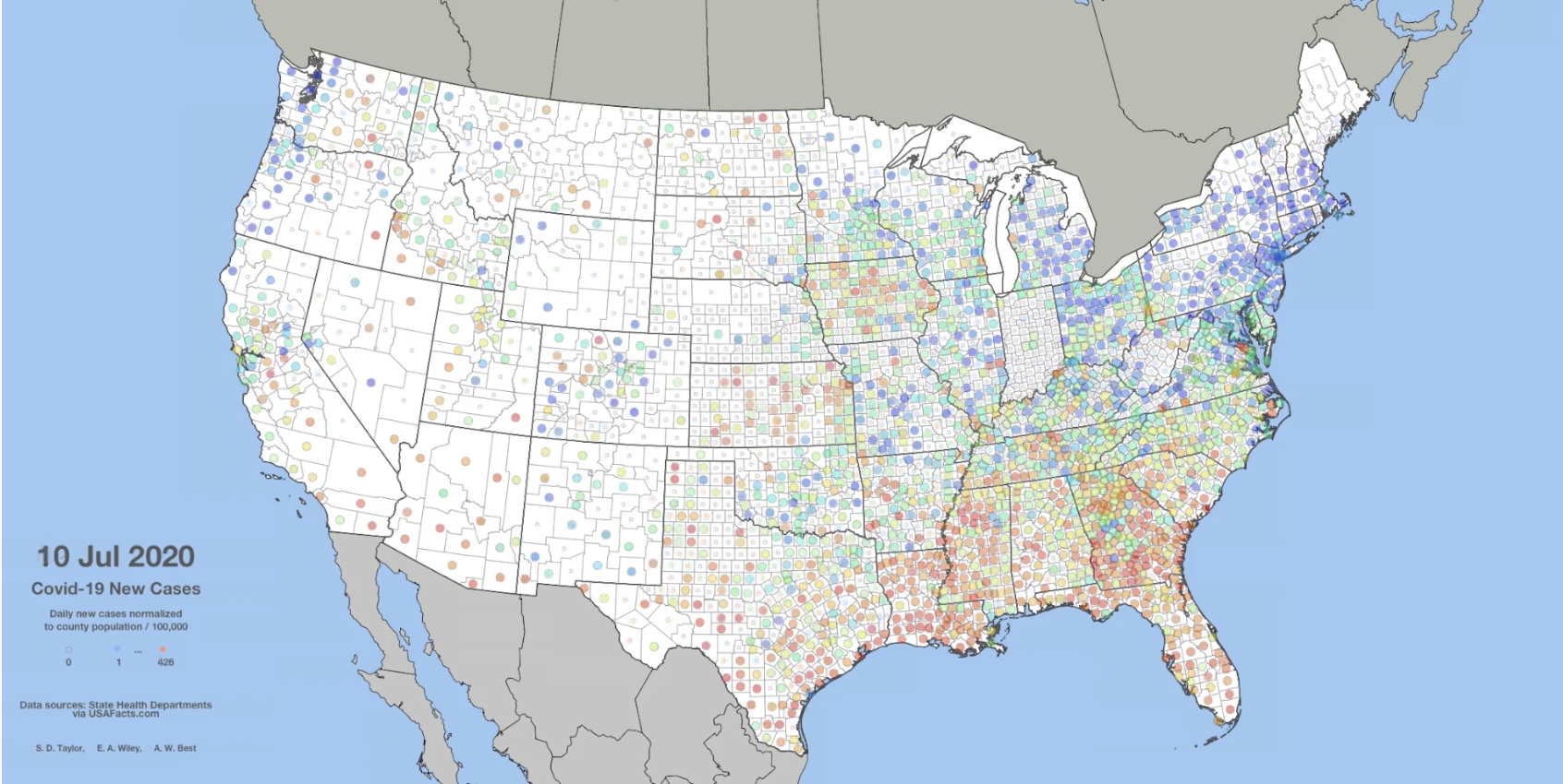
The illustration uses a colored circle to show the daily count of new cases for each county relative to the county's population. We're happy that Cartographica could be one of the tools that was helpful in bringing this animation to life.
Stephen, commenting on his work:
The project started in early April when I and the circle of friends tried to come up with a way of spotting trends and movement in the pandemic. We weren't seeing anything very helpful in the explosion of dashboard websites, though individually they were very good and were early sources of data. That part of it felt familiar. I was part of the BP oil spill response in 2010. That was my first experience with Incident Command and it was ESRIs opportunity to exercise their web technologies. Anyway, we were confident that we could come up with some statistical measure that would give us early warning of outbreaks near our various homes. We couldn't find anything reliable and concluded that what appeared to be trends were actually noise, probably latency in the testing and reporting cycle and a general lack of consistency in the process. The maps reverted to simple counts of new cases normalized to county population as you see on the YouTube animation. That's persuasive enough, especially the last week. Alarming in fact.
And, data sources from the credits:
- Covid-19 Statistics from USA Facts [CC BY-SA]
- Covid-19 Statistics from NY Times [CC BY-NC]
- Political Boundaries from USGS
- Political Boundaries from Census Bureau
- Political Boundaries from Canada GeoBase
- Political Boundaries from Carlos Efrain Porto Tapiquén
Research, analysis, and cartography by S.D. Taylor, E.A. Wiley, and A.W. Best.
Let's all hope this animation becomes a lot less interesting in the near future.
In the mean time, please reach out if you have a map made with Cartographica that you'd like us to feature.