- Tue 21 February 2012
- Cartographica
- Rick Jones
- #buffer, #earthquake
There was a large earthquake today near East Prairie, Missouri that was measured as a magnitude 4.0. According to the USGS the quake was felt by people in at least nine surrounding states.The earthquake was located near the New Madrid Fault line. The Center for Earthquake Research and Information (CERI) located in Memphis, Tennessee works continuously to provide information about the seismic activity in the area surrounding the New Madrid Fault line. Their website provides a lot of information about the science behind detecting and analyzing earthquake activity. Additionally, their website provides free maps and data to explore.
The CERI website provides lists of the most recent earthquake activity from around the country. See the list of the Big Earthquakes that have occurred recently. Big Earthquakes list . This list provides the magnitude, date, time, and the lat lon coordinates, as well as the depth and location. I want to create a map that highlights the location of the recent earthquake in Missouri. To do this I can create quickly create a .csv file with the lat long data required to create a point map. Because I am only interested in the Missouri quake the process of data entry will be quick and painless.
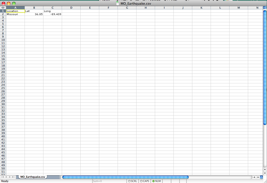
To create the .csv file you will need a spreadsheet application. Once the application is open create new column headings for Location, Latitude, and Longitude. Once the column heads are labeled, add the data from the Big Earthquakes List for the 4.0 East Prairie, MO earthquake. Save the file as MO_Earthquakes.csv.(Note: The lat long data are given as N and W. Make the Longitude value negative to indicate that it is the Western hemisphere. The positive value for latitude already indicates the Northern hemisphere). I provide a screenshot of my .csv to show the set up.
Before we geocode the lat long data first add a basemap. To download a free States layer click Here. Change the State and Equivalent (2010) to "All States in One National File" then click download. Once the file is downloaded import it into Cartographica by choosing File > Import Vector Data. (Note: Rename the Layer States)
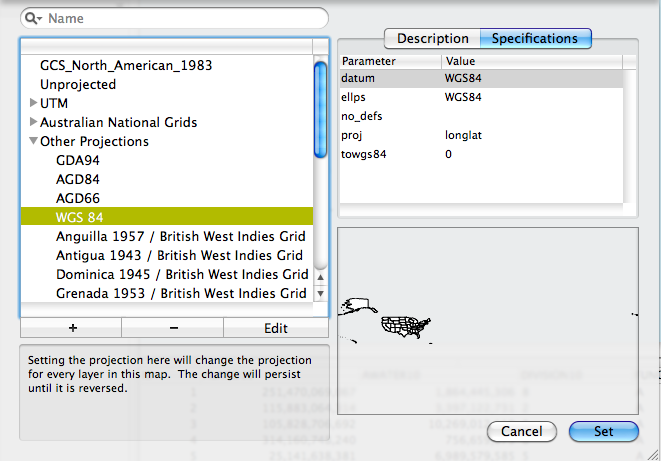
Next, in order to be sure that our coordinates are in the same system as those provided by CERI we can view the projection of the map by choosing Map > Project Map. When you do this with the Census shapefile you will see that the map is projected in GCS_North_American_1983. The coordinates provided by CERI are in WGS. I know this because I found a description on their website describing their data. To change the projection of the map to WGS select Other Projections and the choose WGS84 and then click Set. I provide an image of this below.
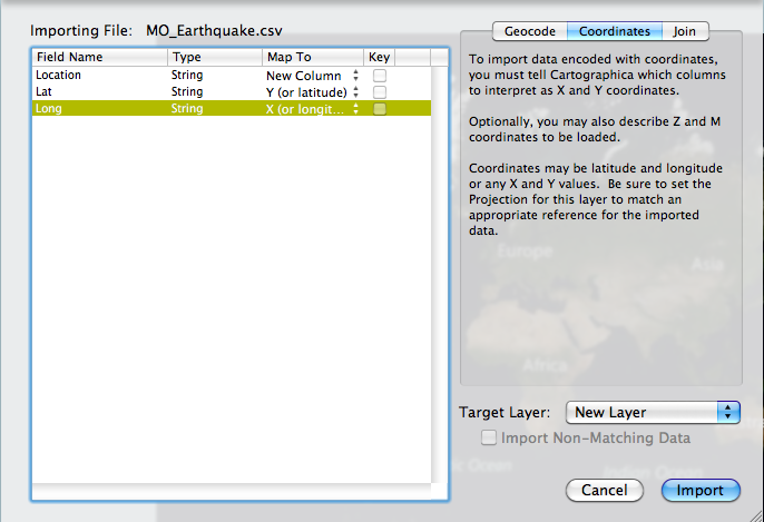
Next, to geocode the lat and long coordinates choose File > Import Table Data. Choose the MO_Earthquake.csv file. In the top right of the Import File Window select the Coordinates tab. In the table to the left change the Map to option for Lat to Y (or latitude) and change the Map to option for Long to X (or longitude). See the image below for the set up.
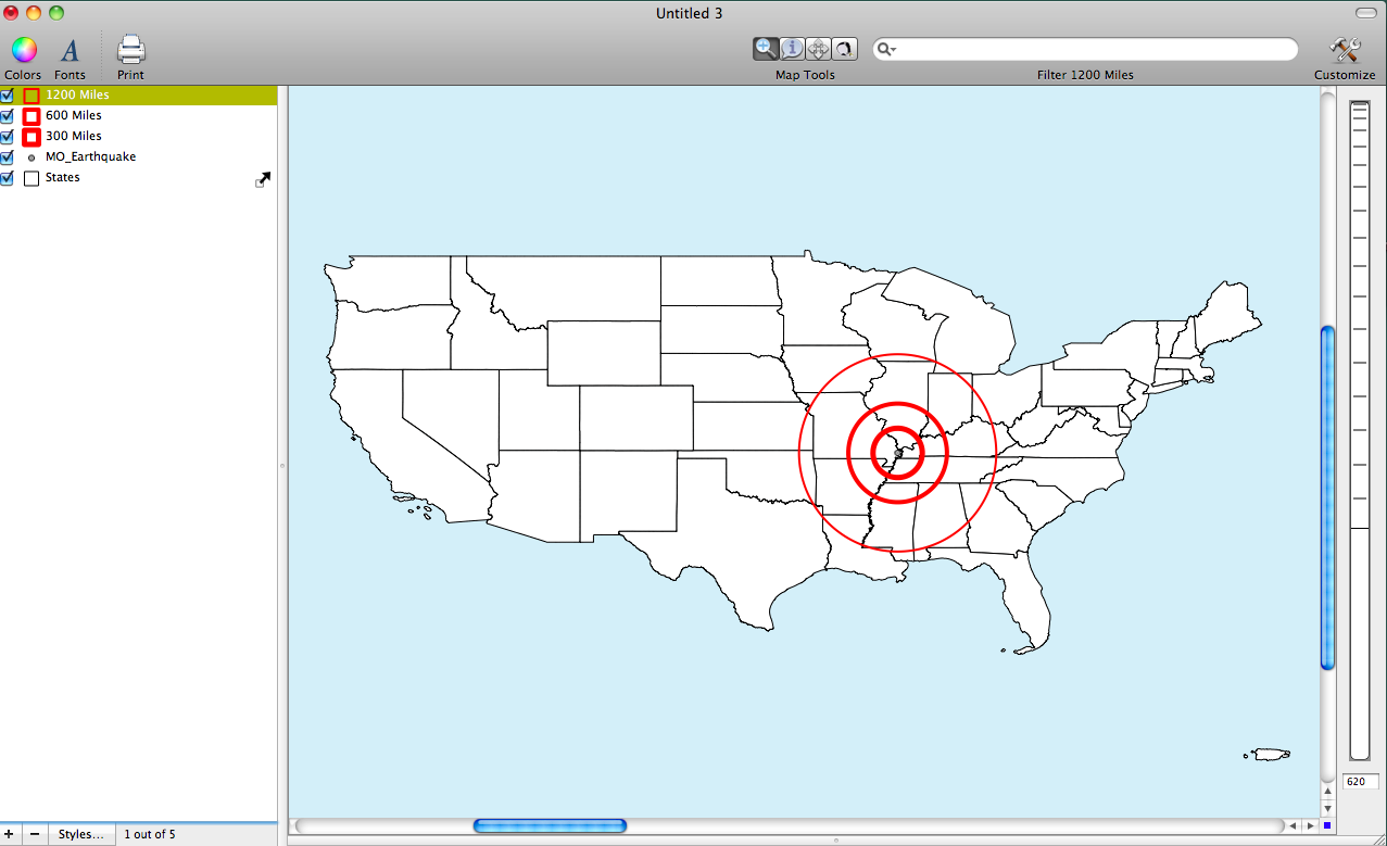
After you geocode the data you should see a single point on the map. To make a more interesting map we can use the point to create a buffer map to indicate distances around the earthquake. To create buffers choose Tools > Create Buffer for Layer's Features. Note that to decide the width of the buffer you must say how large in degrees you would like the buffer to be. How do you define buffer size in miles in terms of degrees? In general, we can say that 1 degree is = to about 60 miles unless the location is located near the poles. We can use this as a rough estimate for creating buffer widths.
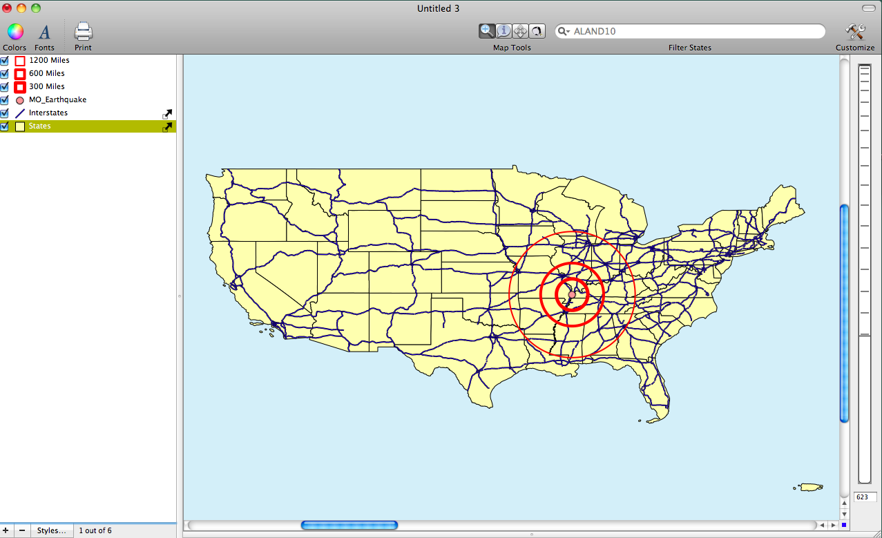
To create an interesting map I decided to create buffers at 5 (300 mi) 10 (600 mi) and 20 (1200 mi) degrees. I provide two maps below to show the final results (Note: the second map adds some additional data that I collected previously from other sources). To create a buffer at each distance simply repeat the steps from above three times while chaining the distance for each buffer. Note that to change the appearance of the buffers go to the Layer Styles Window to play with color, opacity, and labels.