- Tue 28 February 2012
- Cartographica
- Rick Jones
- #choropleth, #global warming, #table
I recently read an article on the Guardian about the changing distribution of carbon dioxide production by country. Carbon dioxide is among the most closely watched greenhouse gases that potentially leads to global warming. According to the Guardian article China has increased its production of CO2 by about 170% since 1984, which is more than the U.S. and Canada combined. Other important changes mentioned in the article are that England has dropped in its production and that India has moved above Russia to the third rank. The U.S. is second in CO2 production behind China.
I found this topic interesting so I went to find some data on the subject to create maps of the situation. Luckily, the Guardian provides data within the article. If you scroll to the data table that is within the article, at the top you will find a link that allows you to download the file. The data are from the International Energy Agency1. There is a bit of house cleaning required with the dataset because of the way the data are recorded. The spreadsheet application you are using may read the data as string rather than as number for this reason. To fix the problem we want to delete all of the data we don't need, and change the values for some of the missing data. Any value recorded as a "--" needs to be deleted. To make this a little easier I deleted all of the countries that were missing data for every year (Note: I did not delete Germany because it has recorded data for later years. Just delete the "--" values for Germany, but not the entire row). If countries have "NA" go ahead a delete those as well. My final data set ended with 188 countries. After the data are downloaded save the file as CO2_Data. The data set is very nice as it provides CO2 emission data by year since 1980.
Because the data are collected for countries we need a shapefile with the appropriate geographies. The website Geocommons2 has a free download for a world wide shapefile with countries. Once you download the shapefile save the file as World and then open it in Cartographica by choosing File > Import Vector Data.
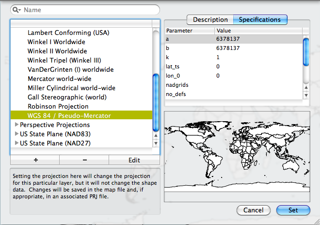
When the country shapefile is imported a yellow triangle will appear next to the layer in the Layer Stack. This indicates that the countries layer is missing a Coordinate Reference System (CRS). To set the CRS double click on the layer in the layer stack, then click on the arrows next to World-Wide Projections and choose WGS 84 / Pseudo-Mercator and then click Set. The yellow arrow should disappear from the layer stack.
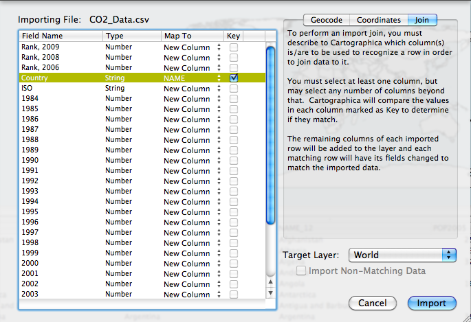
Now that we have both datasets downloaded we can join the data so that we can create maps. To join the CO2_Emissions data to the Countries file choose File > Import Table Data. This will bring up the Import File Window. Inside of the Import File Window select the Join tab in the top right. Change the the Target Layer menu to World. Next, in the table to the left change the "Map to" option in the Country row to Name. This will match the two datasets based on the name of the Country. Then, check the box in the Key column. Once ready, click Import.
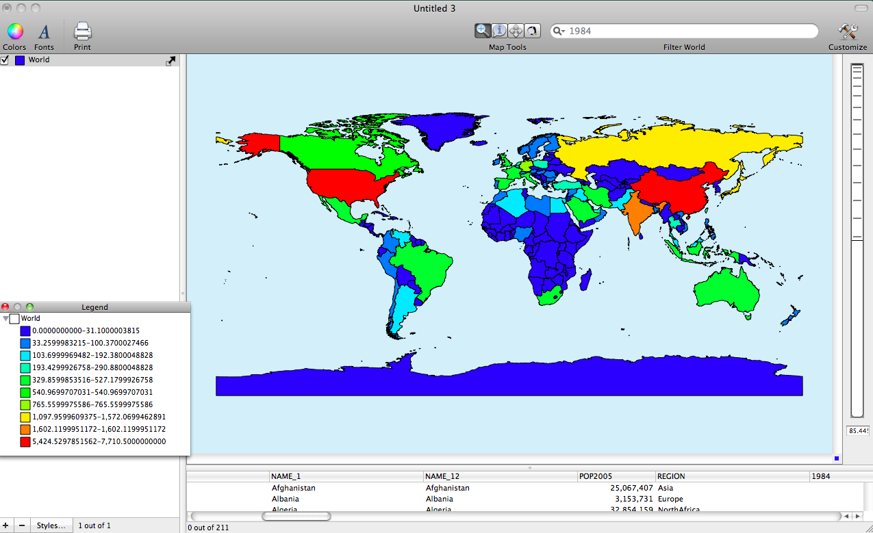
To create maps of the CO2 data double click on the World layer in the Layer Stack. This will bring up the Layer Styles window. Change the Based on menu to 2009. Click on the + button 10 times to create 10 categories. Next, click on the gear and choose Distribute with Natural Breaks (Jenks).
To change the color scheme choose Window > Show Color Palettes. Choose a color palette and drag it to the table in the Layer Styles Window.
I provide three images below of using different variables available within the dataset.
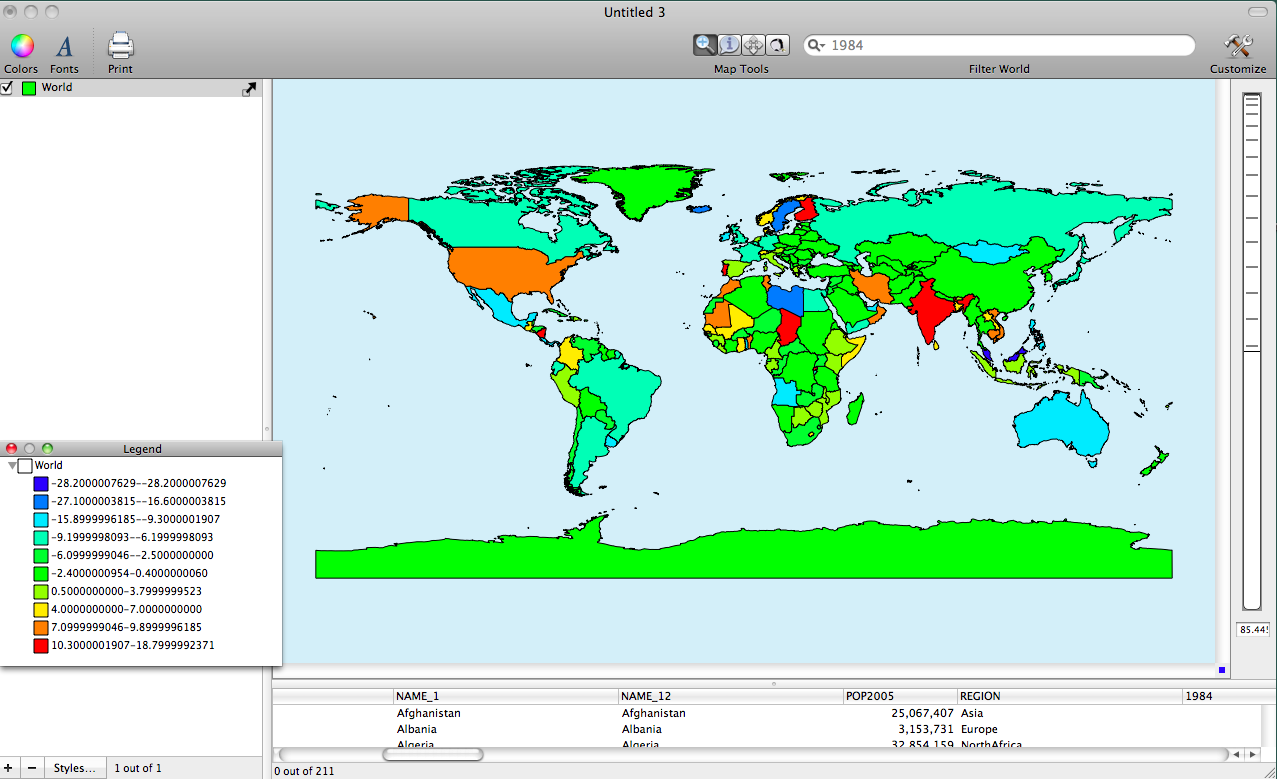
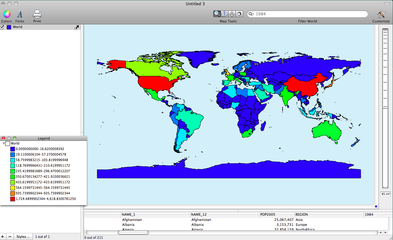
CO2 Emissions 1984
CO2 Emissions 2009
Percent Change between 2008 and 2009