- Wed 21 March 2012
- Cartographica
- Rick Jones
- #choropleth, #housing
The recent foreclosure crisis has resulted in significant economic and social strain throughout the United States. One place hit very hard during the recession is Florida. Florida experienced high levels of foreclosures due to rapid home construction and predatory lending that occurred during the 2002-2005 run up to the recession. In this post I highlight a free source of foreclosure data produced by the Department of Housing and Urban Development through conjunction with the Mortgage Bankers Association and the Federal Reserve. The dataset provided by HUD allows you to download data down to the census tract level on home foreclosures. The data are collected and estimated for the year 2008.
To download the foreclosure data click on the link above to HUD, and then click on the A-F letters alphabetizing the states. For this post I am focusing on counties within Florida so click on the link to the Florida data. It should begin to automatically download. Once downloaded save the file as a .csv.
To create maps we need to download a county file for Florida. The U.S. Census provides free county level shapefiles at this website. Download the Florida shapefile and then import it into Cartographica by choosing File > Import Vector Data.
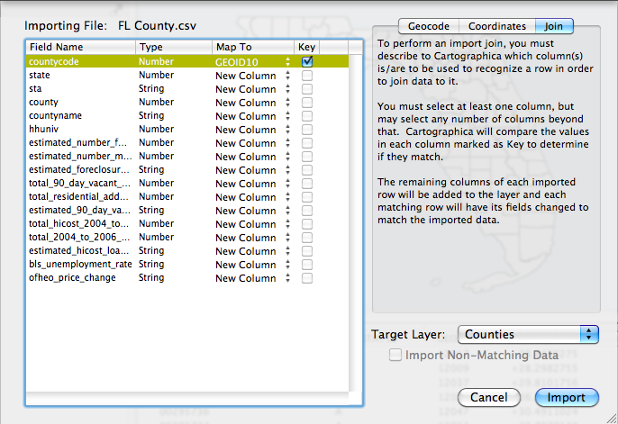
Next, we can join the county level foreclosure data to the U.S. census county file. Choose File > Import Table Data. Select the Join tab in the top right of the Import File window, then change the Target Layer to Counties, finally, link the two datasets using the countycode and GeoID10. Check the box under Key and then click Import. I provide an image below of the set up.
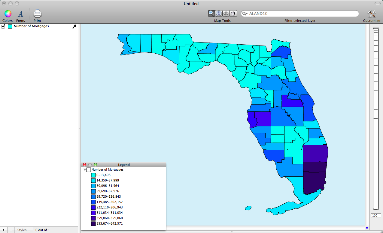
Next, we can map the data. Double click on the Counties layer in the Layer Stack. This will bring up the Layer Styles window. Lets first map the total number of foreclosures by county. This will give us an idea about where the largest housing markets are within the state. Change the Based on menu to "estimated_number_mortgages. Click on the plus button ten times to add ten categories. Next, click the gear box and choose Distribute with Natural Breaks (Jenks).
To see the distribution on the map we need to choose a different color scheme. To change the color scheme choose Window > Show Color Palettes. Select a color palette by clicking and dragging it to the table within the Layer Styles window. I provide an image of the concentration of mortgages within the state.
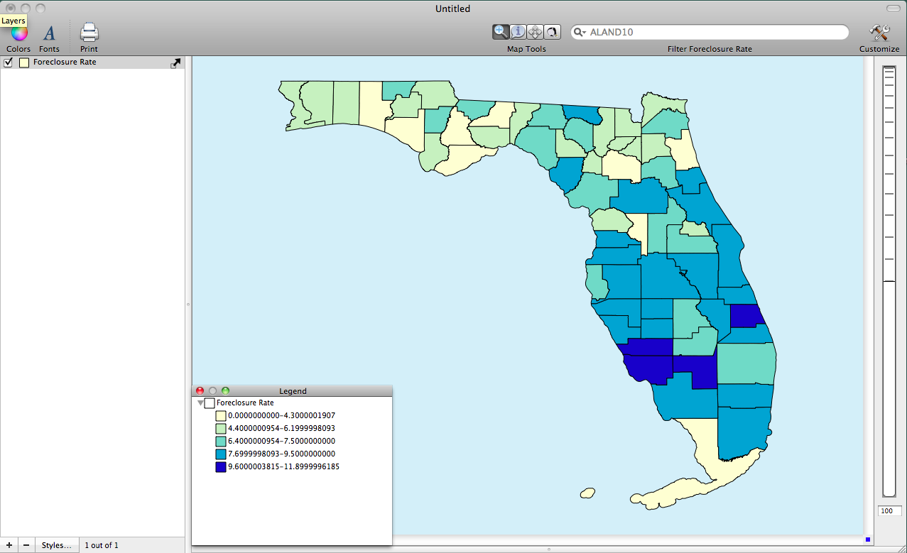
The third image below show the county level distribution of the foreclosure rate within Florida. I changed the number of categories to five and I also changed the color scheme using the same methods as above.
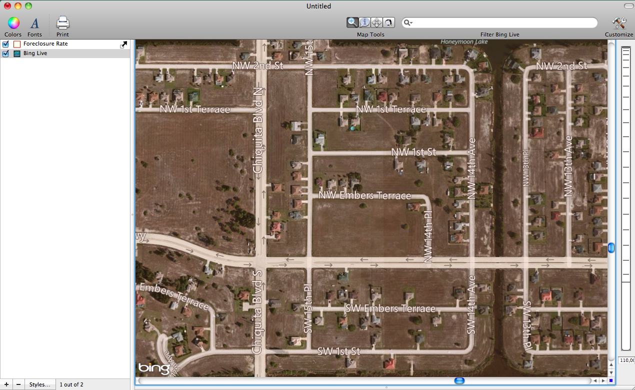
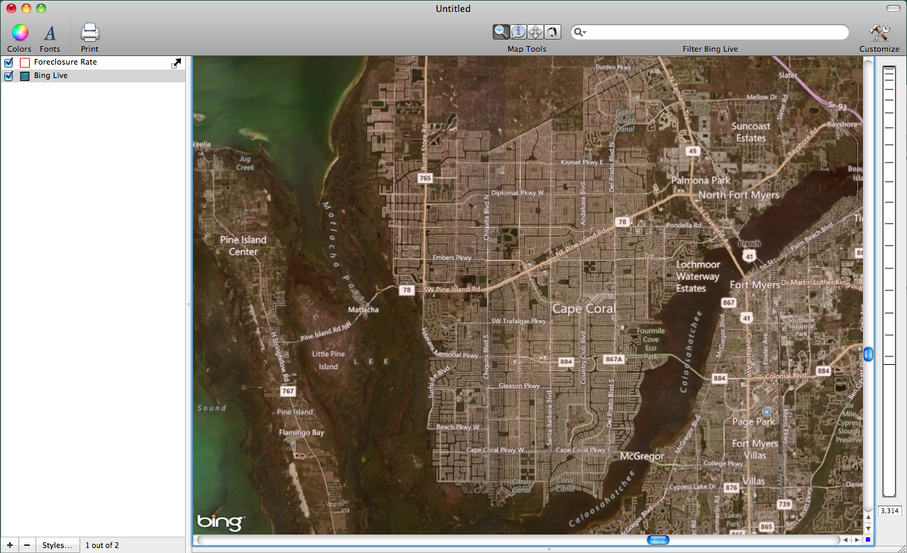
The fourth image below is shown zoomed in on the hardest hit area of foreclosures in the Cape Coral area in Southwestern Florida. Notice the man-made development in Central Cape Coral. This areas was dramatically over built in hopes of capitalizing on the growing home prices that characterized the time between 1997 and 2006. To bring up the underlying satellite imagery, choose File > Add Live Map. I suggest adding the Live Map with Roads and Aerial Imagery to add more context to the map.
The failures of the housing market can be seen in the widespread underdevelopment of the "cookie cutter" homes in central Cape Coral. See the image below for a close up of a badly underdeveloped neighborhood.