- Mon 12 March 2012
- Cartographica
- Rick Jones
- #choropleth, #oil, #resources
In a recent article in the L.A. Times it was reported that the U.S. has decreased oil imports and has increased oil production. This article inspired me to search for data on oil production and consumption by country.
Before we can create a map with this type of data we need a file that we can use to join data to. If you have seen previous posts you will see that we have used a basemap from Geocommons1 . I will be using this baseman again for this post. Download the file and then save it as World.shp. Next, import it into Cartographica by choosing File > Import Vector Data. When the file is imported there will be a yellow triangle next to the layer in the Layer Stack. Click on the triangle and then click Set CRS. Choose the World-Wide Projections option and then find the WGS 84 / Pseudo-Mercator coordinate reference system and then click on the Set button. This process will assign a coordinate reference system to the World layer.
Next, we need to collect data to map. I searched for data on oil imports and exports and found the U.S. Energy Information Administration website. The link above will take you to a downloadable dataset for annual oil production by country. Download the Excel file at the top of the dataset. Once the file is downloaded open it in a spreadsheet application. To clean the data, delete the first two rows. Add a title to column A by typing in Country. Find a delete the row for the Former U.S.S.R., the Hawaiian Trade Zone, East and West Germany, Former Czechoslovakia, Former Serbia and Montenegro, and Former Yugoslavia (Essentially, any country with a data entry of "--" needs to be deleted). Once complete save the file as a .csv.
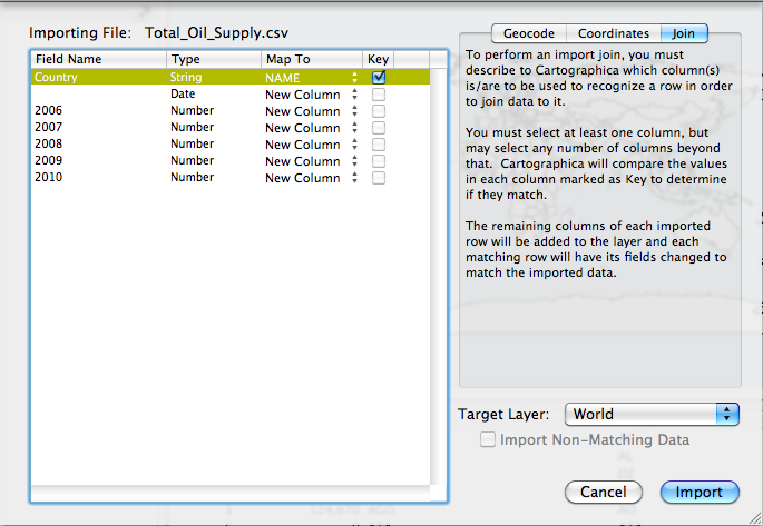
Next, we need to import and join the oil production dataset to the World basemap. To do this choose File > Import Table Data. Select the join tab in the top right. Change the Target Layer to World and then in the table to the left change the Map To option for the Country row to Name and then click Import. I provide an image of the Import File Window below.
Now we are ready to create the map of oil production by country. The dataset that we downloaded is nice because it has oil production over a number of years so we can create a change map indicating where the most oil production has increased, decreased, or stayed about the same. However, lets start by mapping oil production in 2006.
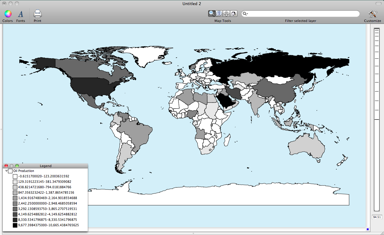
To create a choropleth map of the 2006 oil production double click on the World layer in the layer stack. Change the Based on option to 2006 and then click on the plus button ten times to add ten categories. Next, click on the gear box and choose Distribute with Natural Breaks (Jenks). Next Add a color palette by choosing Window > Show Color Palettes. Choose your desired color palette by clicking and dragging it to the table within the Layer Styles Window. I provide an image below of the 2006 oil production by country.
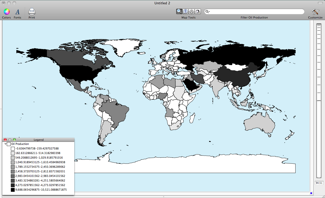
Next, use the same process as above except this time create a map for oil production in 2010. I provide the image of 2010 oil production below.
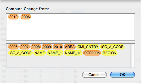
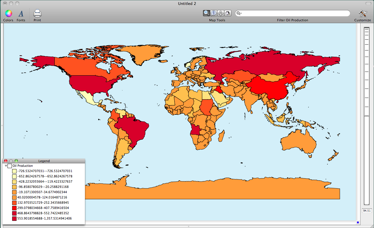
Finally, lets create a change in oil production map by create a new column (variable) that measure the change in oil production between 2010 and 2006. First, choose Layer > Add Column to create a new column. Next, choose Window > Show Layer Info. Find the New column and rename it "Change". Also, change the layer type from String to Number. Next, click the Set Formula button and then set up the formula to match the image below.
Finally, use the same process as above to create the change map. I provide an image below. Notice that the U.S. has been increasing its oil production since 2006, which corresponds with what the L.A. Times article reported.
-
GeoCommons was subsumed into ArcGIS and this data isn't available through a direct link any longer. ↩