- Thu 12 July 2012
- Cartographica
- Rick Jones
- #Data, #environment, #vector
The Pacific Institute has recently released a set of GIS data on measures of Sea Level change on the West Coast. This is a topic that has been in the news recently as scientists are investigating changing sea levels along coasts around the world. We are always trying to point our customers to new sources of data that they can use in their own professional work, or for the purpose of exploring the world around them with publicly available data. To download the Pacific Institute data visit the GIS Data Downloads section. Notice when you go to the website there are a number of files available that cover many different topics. Below I describe the methods for importing and exploring the data using Cartographica.
The first step for exploring these data is adding a Live Map, which we will use as the basemap for all of the Pacific Institute's data. To add a Live Map choose File > Add Live Map.
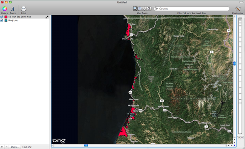
To create the following maps download the Dataset described as "Areas inundated by unimpeded Pacific coastal flooding under a scenario of 1.4-meter (55-inch) sea-level rise." To download the data click on the Ca_coast_yr2100_flood.zip file. The file will automatically download. Once the data are downloaded save them to an desired location and then choose File > Import Vector Data and open the shape file. When the data are imported they will have a name that is not so descriptive and will be colored white. Rename the layer so that it was a bit more descriptive. Rename the layer 55 Inch Sea Level Rise by clicking on the layer in the layer stack and retyping the layer name. Change the color to red to make the layer more visible on the map. To change the color double-click on the 55 Inch Sea Level Rise layer in the layer stack and then change the fill color to red by clicking on the fill box and then using the color wheel to choose a reddish color. See the image below for an example of my map.
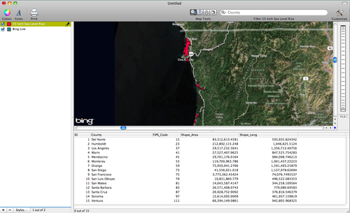
In addition to the geographic data, the files also include attribute data that provides a description of the locations at risk for flooding. To view the attribute file view the data in the data viewer at the bottom of the Cartographica window. Notice that the at-risk areas are named by which county they are in and there is data on the area and length of the individual locations.
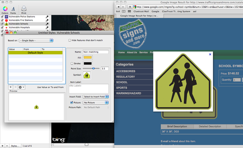
For the next map, download the available data files that contain vulnerable public service buildings. Download the files for: vulnerable hospitals, schools, fire stations, and police stations. Once the files are imported change the names and color schemes to make a more effective map. Rename the layers Vulnerable Hospitals, Vulnerable Schools, etc. To make the symbols a bit more exciting you can use publicly available images of symbols representing each type of public service. To do this, go to Google Images to search for each type of symbol. For example, to find the school symbol use the search term "School Symbols". Once you find the image you would like to use double-click on the Vulnerable Schools layer in the layer stack and then simply click and drag the school symbol image into the symbol box within the layer styles window. Once the image is placed in the symbol box make sure to uncheck the stroke box, otherwise the image will be outlined and it will be hard to see. I provide an image below as an example.
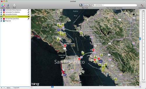
See my final map below for an example of the point symbols for public service buildings at risk of coastal flooding in California. The image below shows the San Francisco Bay Area. I should mention that each of the public service building files also has accompanying attribute data that provides more information about the locations of each of the points.
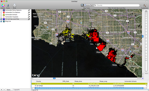
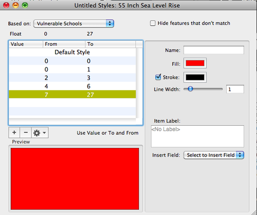
Because you have a points and polygons added to the map you can use Cartographica's Count Points in Polygons tool to determine which of the flood prone areas have the most at risk public service buildings. To count points in polygon first select the 55 Inch Sea Level Rise layer in the layer stack, and then choose Tools > Count Points in Polygons. At this point a new window will appear, choose to count the number of at risk schools within each of the areas at risk of flooding. Once the count is complete you can see the number of at risk schools in each polygon by looking in the data viewer window. Another way you can check the number of at-risk schools in each polygon is by creating a choropleth map. To create a choropleth map double-click on the 55 Inch Sea Level Rise layer in the layer stack to bring up the layer styles window. Change the Based on option to Vulnerable Schools, click on the + button five times to add five categories, click on the gear box and choose distribute with Natural Breaks (Jenks). Finally, select a color scheme by choosing Window > Show Color Palettes, select a color scheme and then click and drag it to the table within the layer styles window. This will automatically apply the color scheme to the distributed values. I provide an image of the layer styles window and my final map below.
As you can see from my map below it appears that the Orange County area in Southern California has some coastal areas that have many schools at risk of flooding if the sea level were to rise by 55 inches.
