- Fri 03 February 2012
- Cartographica
- Rick Jones
Oil prices are a continuing concern of people all over the world. There are a lot of variables that enter into the price of oil, including where the supplies are relative to the demand and how much is controlled by a single party. Oil fields vary in size and in the amount of oil that they contain.I was curious about spatial distribution of oil fields and how much oil the fields contained. To visualize the issue I found data from the USGS.
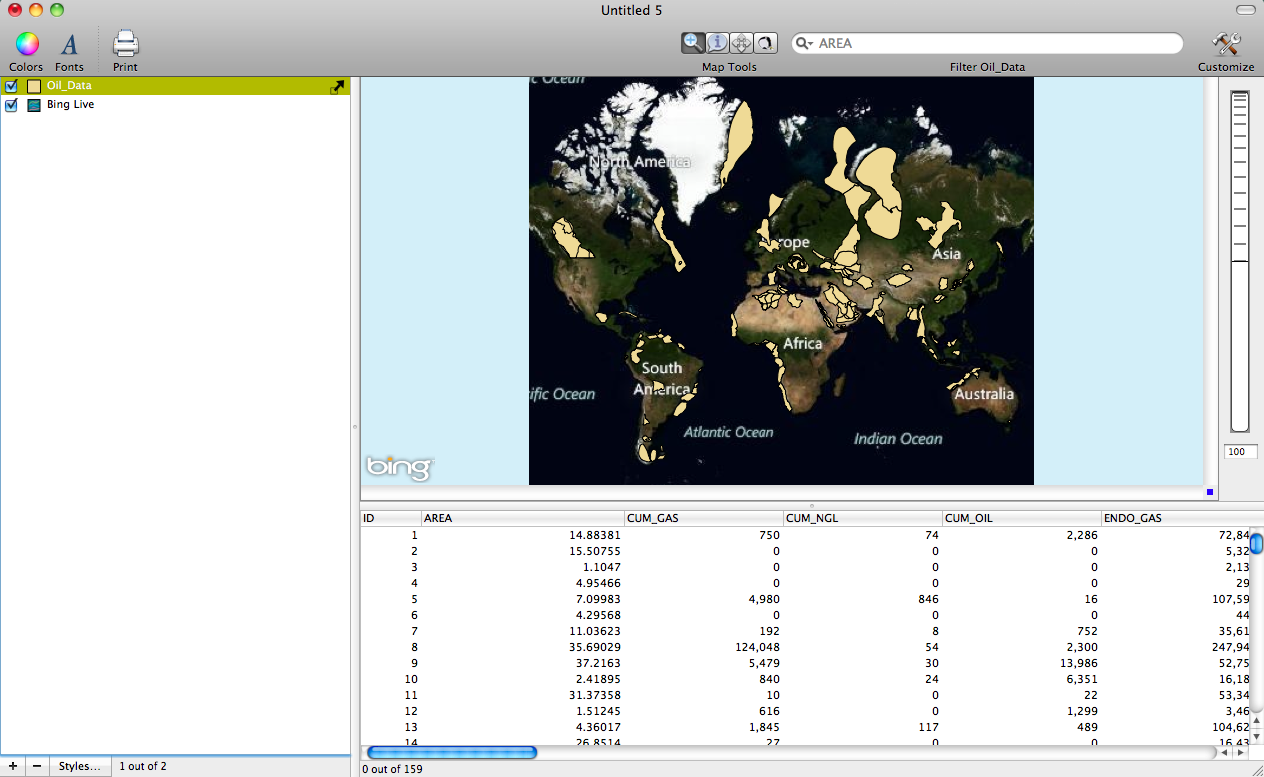
The shapefiles that you can download show the locations of many of the worlds known oil fields.The datasets actually contain many variables for each oil field in the dataset, which is quite nice for exploration. For this post I am using the "Total Petroleum System Summary Data" shapefile.
To import the data into Cartographica choose File > Import Vector Data
The data are downloaded unprojected and without a coordinate reference system. However, the data are in a geographic coordinate system, which Cartographica guesses based on the extent of the map. We can project the data "on the fly" by simply adding a Live Map. To add a live map choose File > Add Live Map. This will automatically project the data using a pseudo-Mercator projection. Below is a screenshot of the oil field data after they are projected.
Note: The shapefile will still not be accompanied with a .prj (projection file). To create a .prj file you need to export the layer and save it as a new file. To do this choose File > Export Layer Feature and Save the layer as Oil__Data. Creating a .prj is not necessary unless you want a copy of the .prj file.
Once you have created you new layer import it by choosing File > Import Vector Data
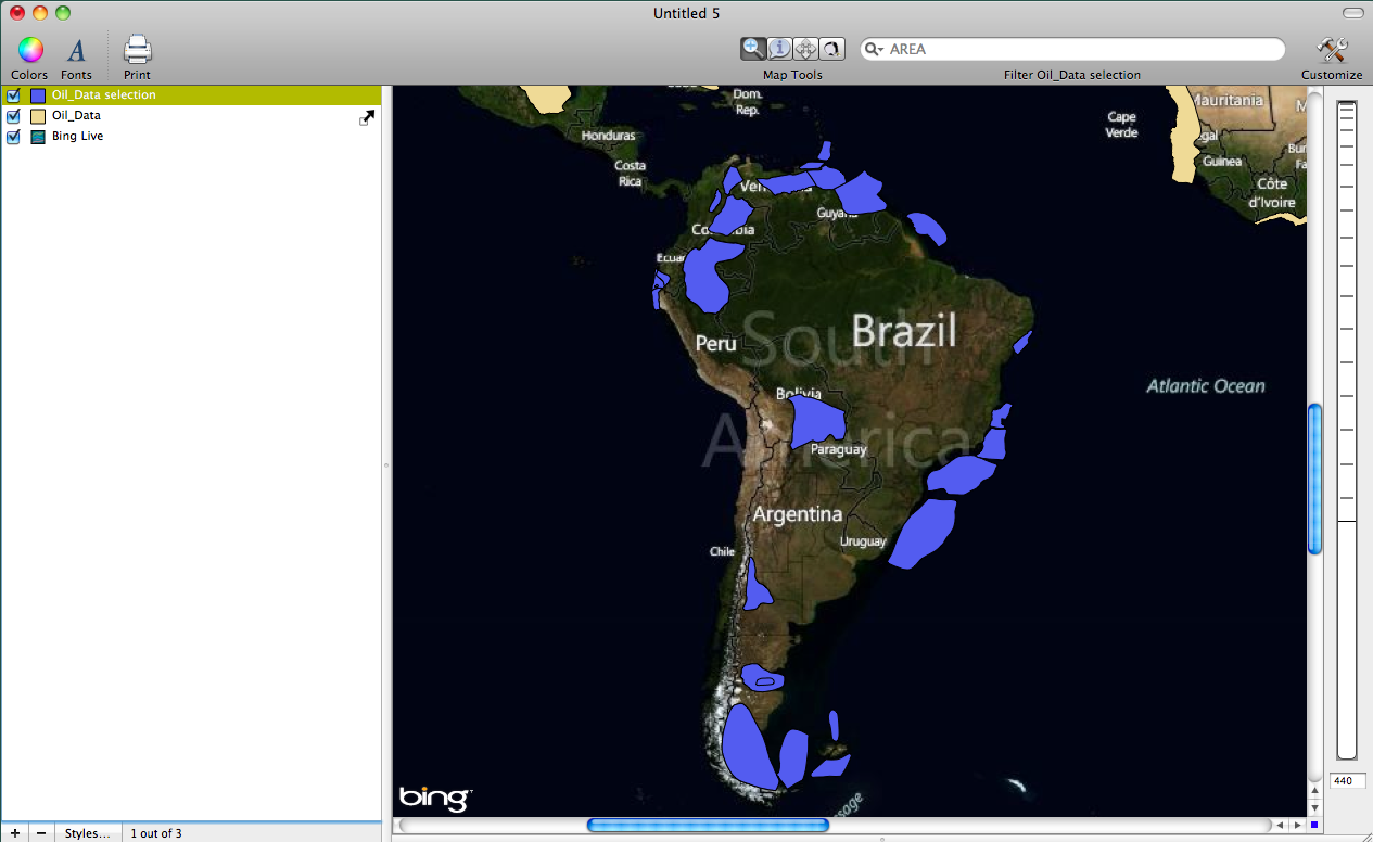
Because the dataset contains many oil reserves from all over the world I decided to focus only on the oil fields in South America. In order to create a map that contains only the oil fields in South America we need to create a new layer. To create a new layer that contains only South American oil fields…
Click the Identify tool and then draw a box around the South American oil fields to select the polygons. Then choose Layer > Create Layer from Selection. This will add a new layer to the Layer Stack that contains only the South American oil fields. Below is a screenshot showing the new layer added to the layer stack.
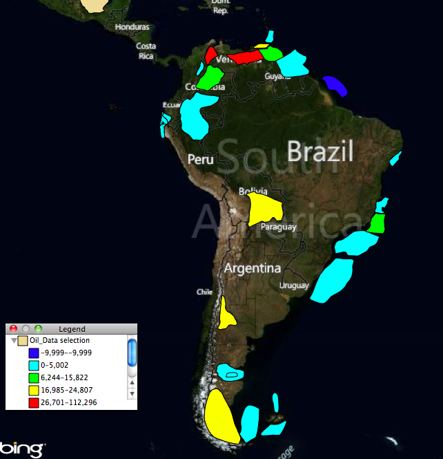
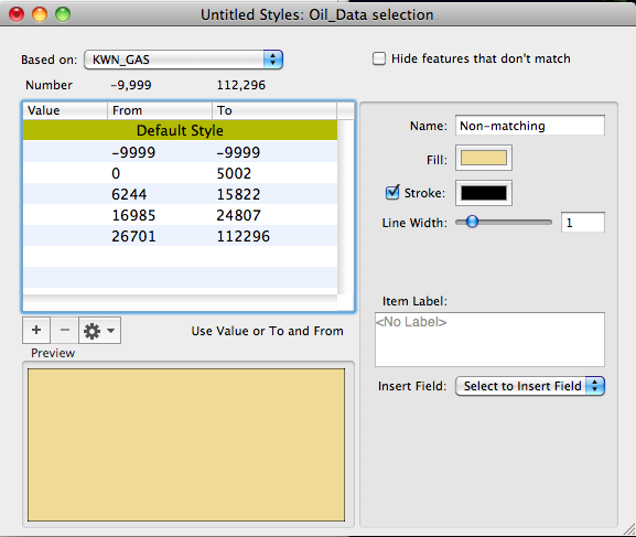
To create a choropleth map we need to use the Layer Styles Window. To view the Layer Styles Window double click on the Oil_Data_Selection layer in the Layer Stack. Change the "Based on" option to KWN_GAS. This is the variable that tells us how much known gas exists in each oil field.
Next, click the "+" sign five times to add five categories to the table within the Layer Styles Window. Then click the gearbox and "Distribute with Natural Breaks" The classification will change in the window. The bottom category should be -9999 to -9999. Change the second category so it reads 0 to 5002 (change -9999 to 0). Note that -9999 are codes for missing data. Below is a screenshot of the Layer Styles Window after it is set up.
Next, change the color scheme by choosing Window > Show Color Palette; then choose a color palette and drag it to the table within the Layer Styles Window. Below is a screenshot of the final output.