- Tue 31 January 2012
- Cartographica
- Rick Jones
I recently came across an article on The Guardian that looks at gun crime in the United States. The article includes several maps and it also includes downloadable gun crime data for U.S. states. In this post I show how to import the downloaded data into Cartographica to replicate the maps produced in the article.
To download the data click on "Get the Data" within the article and then download the data in .csv format. The data set contains the total number of murders, total firearm murders in 2010 and 2009, total handgun murders, and the rates of firearm murder, robbery, and assault per 100,000 population in all 50 states. Note that there are missing data for Florida.
After the data are downloaded open them in a spreadsheet application. Delete the second row that contains the totals for the entire United States. We only want data for states. Once completed save the file as US_Gun.csv
Next, we need to download a shapefile for the 50 U.S. states. Go to the U.S. Census Tiger/Line Files webpage to download the shapefile. Under the "Select Layer Type" drop down menu choose "States (and equivalent)".
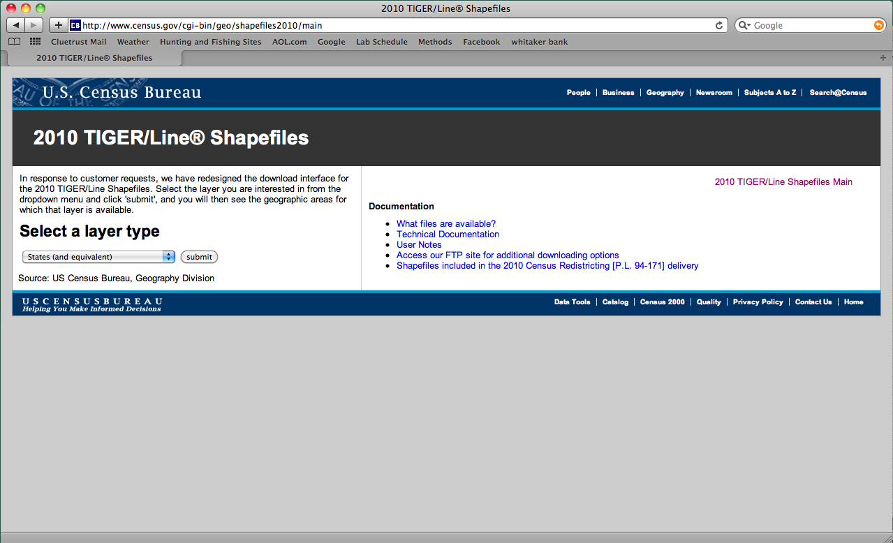
On the next webpage, under the "State and Equivalent (2010)" drop down menu choose All states in one national file and then click download.
After the data are downloaded open the shapefile in Cartographica.
Next, to import and join the .csv file containing the gun data to the U.S. states shapefile use the following steps.
-
Choose File > Import Table data...
-
Choose the
US_Gun.csvfile -
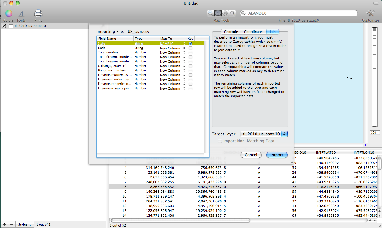
Next, we need to match the .csv file to the states shapefile. Click on the Join tab in the top right of the import file window.
-
Change "Target Layer" in the bottom right to
tl_2010_us_state10(this should be the title of the state shapefile). -
Under the "Map to" column change the designation from "New Column" to NAME10 for the State row and then check the box under the Key column. Once this is set up click Import. The screenshot below shows what this should look like.
Now that the data are joined we can create maps.
-
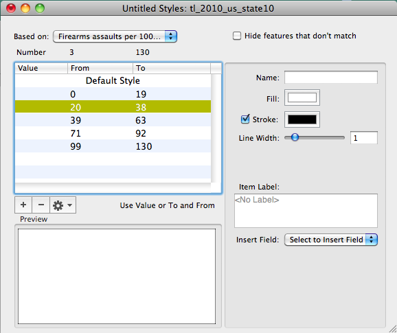
Double click on the states layer in the layer stack to bring up the layer styles window.
-
Under the "Based on" drop down menu change the designation to "Firearms assaults per 100000 population" (this will replicate the first map from the guardian article).
-
The map in the guardian article uses five categories to define the map. We will match this by clicking the "+" button five times. The one place where we will deviate from the Guardian article is in the ranges we choose for each of the five categories. The Guardian article's categories are not mutually exclusive. For example, the first category ranges from 1-10 and the second from 10-20. States with 10 firearm assaults per 100000 population are contained in both categories. To address this we will use a different classification method. Click on the gearbox and choose Distribute with Natural Breaks (Jenks).
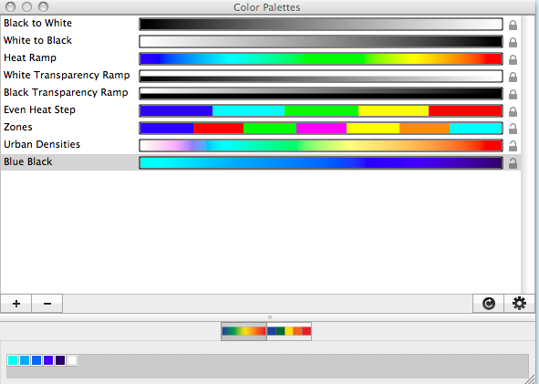
Finally, choose Window > Show Color Palettes. Here we can use one of Cartographica's built in color schemes or we can choose to make our own. Lets make our own. The guardian map uses a red to black ramp. In order to differentiate our map from theirs use a blue to black ramp. Follow the steps below to create a new scheme.
-
Click the "+" button to add a new color ramp.
-
Next, near the bottom of the Color Palettes window there are small white boxes. Click on those so that there are six white boxes.
-
Begin creating the color ramp by double clicking on each box and then select the desired color for each box. Once you have the colors selected rename the new palette to Blue Black. The screen shot below shows the final product.
Now that we have a new color ramp go back to the layer styles window and click and drag the new color ramp onto the categories to change the color scheme for the Firearms assaults per 100000 population data. The map I created using this process is shown below.
