- Mon 16 July 2012
- Cartographica
- Rick Jones
- #join, #social, #vector
Richard Florida is the well-known author of the book "The Creative Class" which describes the rise and the importance of a socio-economic class of individuals that Florida believes drives economic and social development. According to a Wikipedia, the creative class is made up of two separate groups of workers that make up about 30 percent of the U.S. workforce. The first of these groups is the Super-Creative Core: This group comprises about 12 percent of all U.S. jobs. It includes a wide range of occupations (e.g. science, engineering, education, computer programming, research), with arts, design, and media workers forming a small subset. Florida considers those belonging to this group to “fully engage in the creative process” (Florida, 2002). The Super-Creative Core is considered innovative, creating commercial products and consumer goods. The primary job function of its members is to be creative and innovative. “Along with problem solving, their work may entail problem finding” (Florida, 2002). The second group in the creative class is the Creative Professionals: These professionals are the classic knowledge-based workers and include those working in healthcare, business and finance, the legal sector, and education. They “draw on complex bodies of knowledge to solve specific problems” using higher degrees of education to do so (Florida, 2002).
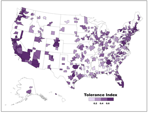
Part of Florida's Creative Class philosophy is that those people who largely make up the creative class are most commonly found in cities. Because of this cities are central to economic and social growth and a hugely important moving forward in the future. In an article posted today in the Atlantic, Florida has used his team of experts to create a new index that measures how tolerant cities are of other people's ideas and innovations. The article, which can be found at this website, describes Florida's three T's of innovation which are technology, talent, and tolerance. His most recent article shows a choropleth map of U.S. metros with color shades indicating levels of tolerance within each city. According to the article the tolerance index "ranks U.S. metros according to three key variables—the share of immigrants or foreign-born residents, the Gay Index (the concentration of gays and lesbians), and the Integration Index, which tracks the level of segregation between ethnic and racial groups." See below for a screenshot of Dr. Florida's Tolerance index.
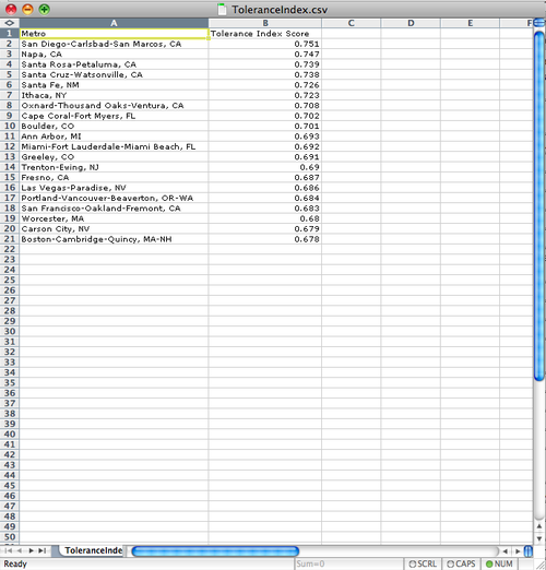
Unfortunately, the article does not provide a link to the Tolerance Index dataset, but it does provide a short list of the top 20 most tolerant cities in the United States. We can use this list of the top 20 most tolerant cities as an example of how to quickly create our own map from a list such as the one provided. The first step in creating your map of the 20 most tolerant cities is to use a spreadsheet application to create a dataset that you can import into Cartographica. This requires a bit of data entry, but it's fairly painless. Once the data are entered save the file in .csv format. I provide an image below of my spreadsheet.
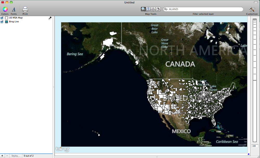
To create the choropleth map of the U.S. metros you need to have a basemap that contains the U.S. metro areas of interest. To download a shapefile containing the metropolitan statistical areas visit this U.S. Census Bureau webpage. Once on the webpage, under the Nation-Based Shapefiles, select Metropolitan/Micropolitan Statistical Areas, and then click on the Downloaded Selected Files button. After the file is downloaded import the file by choosing File > Import Vector Data. To provide more context to the map add a Live Map as well by choosing File > Add Live Map. Be sure the Metro Areas map is on top of the Live Map in the Layer stack. See my map below for the full set of U.S. MSAs.
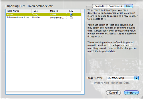
To join the top 20 Tolerance Index scores to the MSA map choose File > Import Table Data. This will bring up the import file window. Select the Join tab in the top right, change the Target Layer to the US MSA Map layer, change the Map To option to Name, check the box under Key for the Metro field, and then click on the import button. I provide an image below to show the set up.
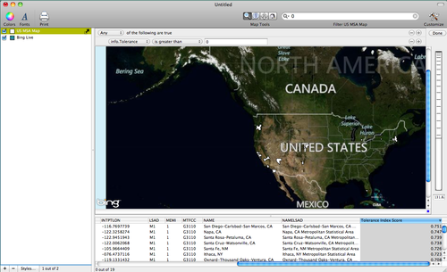
Because the .csv file you imported does not have data for all of the MSAs in the MSA file you can use Cartographica's Filter Bar to identify only those cities for which we have Tolerance Index data. Click on the magnifying glass inside of the Filter Bar and then select the Tolerance Index Score field. Type in 0 in the filter bar, a small window will appear that allows you to choose selection criterion. Select the option "is greater than". This will select only those cities that have values greater than 0 for the Tolerance index score. Notice the number of MSA visible on the map is much fewer than the original map. See the map below for an example.
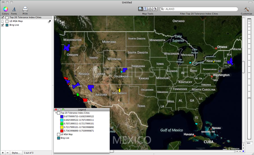
Finally, use the identify tool to select all of the remaining MSAs and then choose Layer > Create Layer from Selection. This will automatically add a new layer to the layer stack that contains only the top 20 tolerance index cities. Rename the new layer "Top 20 Tolerance Index Cities". You can create your own choropleth map of the top 20 cities by double-clicking on the Top 20 layer in the layer stack, click on the + button five times to add five categories and then select a classification scheme (I used Equal Interval) by clicking on the gear box. Add a color scheme by choosing Window > Show Color Palettes and then click and drag the color ramp to the table in the Layer Styles Window to add the color scheme. Also, you can add a legend by choosing Window > Show Legend. I provide an example of my final map below.