- Thu 09 February 2012
- Cartographica
- Rick Jones
The World Bank is an international organization headquartered in Washington D.C. that organizes and funds efforts to reduce poverty and promote development around the world. It is a large organization that is made up of more than 9,000 employees with over 100 offices throughout the world.
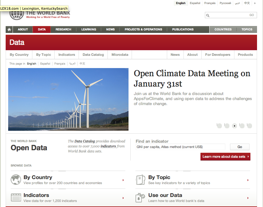
The World Bank not only provides funding, but they also provide access to large amounts of data with the purpose of promoting policy analysis and development. The data available from the World Bank is vast, and covers more than 200 countries with thousands of variables and indicators to choose from. Here is the website for the World Bank's Open Data resources
For this post I went to the Open Data link above and I selected to choose data "By Topic". Under the Topics page there are many options to choose from. I decided to look at Health data. I then chose to look at life expectancy data for the available countries. Note: Once you choose the data you want you can choose to download the data as an Excel file or in .XML. I downloaded it as an Excel file. I provide a screenshot of the World Bank Open Data webpage below.
After the data are downloaded I had to do a little extra work to get rid
of some data that I did not need. The first several rows are life
expectancies for regions, or specific social groups. I only want the
life expectancies for countries so I deleted rows 2-29. This will leave
only the column labels and countries beginning with Afghanistan and
ending with Zimbabwe. After the data are cleaned I saved the file as a
Life_Expect_60_09 The data are comprehensive and are given for each
year between 1960 and 2009. Note:There are missing data for a few
countries.
In order to create informative maps we need to have access to a shapefile for all of the worlds countries. We need this so that we can join the World Bank data to their respective geographic units. The website Geocommons provides free a free download of World Countries. The file includes population data, but most importantly it provides the names of each country which we can use to match the World Bank data. Once the file is downloaded import it into Cartographica by choosing File > Import Vector Data.
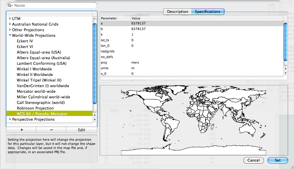
When the data are imported a yellow triangle will appear next to the layer in the Layer Stack. This indicates that the countries layer is missing a Coordinate Reference System (CRS). To set the CRS double click on the layer in the layer stack, then click on the arrows next to World-Wide Projections and then choose WGS 84 / Pseudo-Mercator and then click Set. The yellow arrow should disappear from the layer stack. I provide an screenshot of the Set CRS window below. Note: its not necessary to change the CRS, but it is good practice.
Now that the countries data are set we can join the World Bank data and
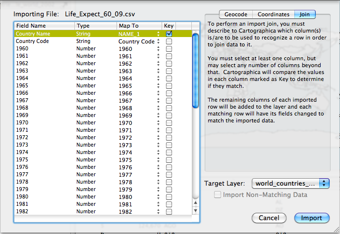
then create maps. To join the World Bank data choose File > Import
Table Data. Select the Join tab in the top right of the window.
Change the Target Layer menu to world_countries_... Change the Map
to column in the Country Name row to Name_1 and then check the box
under the key column. I provide a screenshot to show the set up…Once its
ready, click Import.
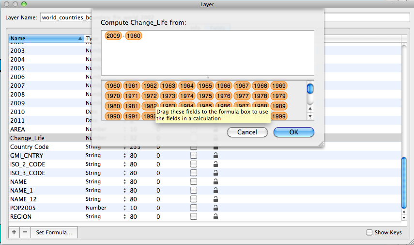
Next, I want to create a new column/variable the tells me how life expectancy has changed over the years. To create the change variable I am going to subtract the life expectancy in 1960 from the life expectancy in 2009. The difference will tell us about the change in life expectancy over time. To create a new column choose Layer > Add Column.
Next, choose Window > Show Layer Info. Scroll down and find column
named New Column, rename the column Change_Life. Also, change the
variable type from String to Number: this tells Cartographica that
the Change_Life column can accept mathematical operators. Select the
Change_Life column and then click Set Formula. First, click and drag
2009 into the window then add a - sign and then click and drag 1960
into the window. The screenshot below shows the set up. Once ready,
click OK.
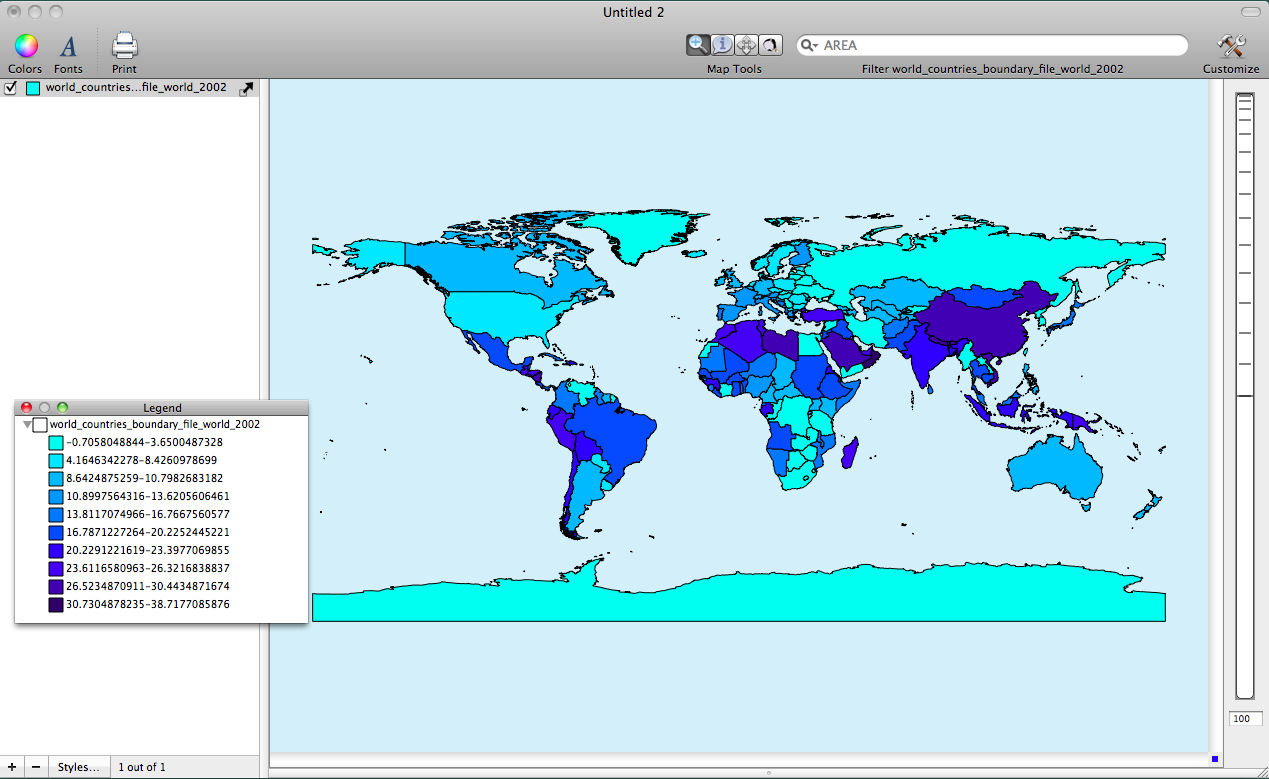
Finally, create the map indicating change in life expectancy by double clicking on the world_countries layer in the layer stack to bring up the Layer Styles window. Change the Based on menu to Change_Life. Click the + button ten times to add ten categories to the table. Next, change the color scheme by choosing Window > Show Color Palettes. Select a color palette and drag it to the table within the Layer Styles window. This will change the map. I provide a screenshot below. Interpreting the final map shows that countries shaded darker blue have had more positive increase in life expectancy over the years.