- Wed 01 June 2011
- Cartographica
- Rick Jones
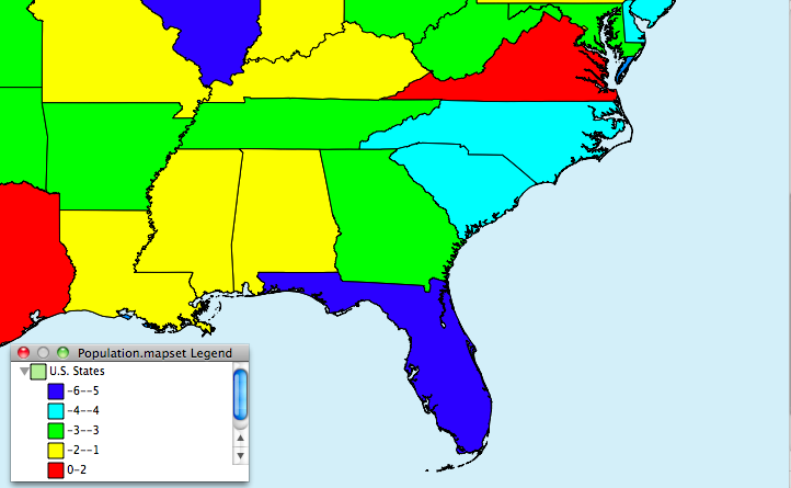
The Housing Price Index is a quarterly report produced by the Federal Housing Finance Agency that describes the quarterly performance of home values. The index is an important measure of the economy especially because of the recent problems in the housing sector. For this post I created a state level data set showing the percent changes in the HPI across the United States since the last quarter of 2011 using data from the FHFA
In the image below the states that are in red have experienced the most problems with decreasing home values. States with either light or dark blue have faired better since the last quarter of 2010.
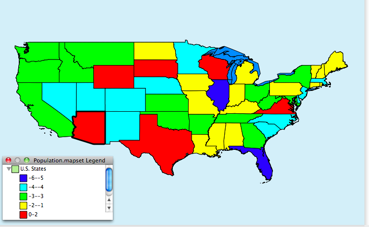
An important point to make is that states who are not shown to have lost HPI points since the fourth quarter of 2010 does not mean that these locations are free from problems associated with the decrease in home values. It may be that the states that show gains, or only moderate changes in HPI have leveled off after a long period of decline.
The reaction to the drop in the HPI was an increase in lack of confidence that the economy is making a recovery. We have seen rebounds in the DOW and S&P, but the recent HPI data seems to indicate that there are still substantial problems in the housing sector.
The second image shows the same data, but with a focuses on the southern states.