- Wed 01 August 2012
- Featured Maps
- Rick Jones
We are continuing our coverage of the 2012 Olympic games in London, England, and we have an updated medalcount.csv file that can be used to map the distribution of medal counts around the globe. Download the medalcount.csv file. The medal counts are accurate up to 1:00pm on Wednesday, August 1. [Updated Final medal counts are available by downloading Final_Medal_count.csv] Once downloaded, save the file as a .csv. This dataset can be used to create choropleth maps and can be continually updated as the games progress.
Download the World file from Geocommons and then import the data by choosing File > Import Vector Data. View the previous Cartographica blog post, "Mapping the Distribution of Olympic Athletes" to see the problem with joining data Hong Kong data to the geocommons file. Essentially, Hong Kong is included inside of China on the Geocommons file rather than being an independent nation, in the post linked above I show you a way around this problem.
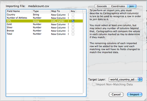
Join the medalcount.csv dataset to the World shapefile by
choosing File > Import Table Data. This will bring up the Import
File Window. Click on the Join tab in the top right pane, change the
Target Layer to World, in the left pane, change the Map to option in the
FIPS field to FIPS_CNTRY, and check the Key box. When ready click
Import. The final dataset will then include the original data from
the World file from geocommons and it will also include the data
imported from the medalcount.csv dataset. As a result, there will be two
country name columns (one from both files), the FIPS_CNTRTY column
(from geocommons), and the Number of Athletes column and the Gold,
Silver, Bronze, and Total Medal Count columns. (from the medalcount.csv
file). There are two country name columns in the final dataset because
the geocommons and medalcounts.csv files each included a "country name"
column that was not used in the joining procedure. The FIPS column from
the medalcount.csv dataset is not imported because the FIPS column is
used to match to the FIPS_CNTRY column from the geocommons World file.
Since the medalcount.csv data are imported based on the identical match
between the FIPS column and the FIPS_CNTRY column, it follows that if
the FIPS column was imported it would be an identical match to the data
in the FIPS_CNTRY column. See below for the set up.
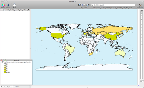
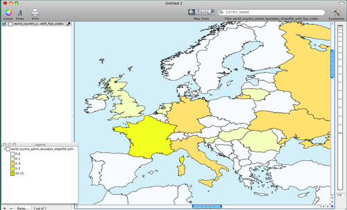
You can create a choropleth map of the distribution of the medal counts by double-clicking on the World layer in the Layer Stack. Change the Based on menu to Gold, Click on the + button five times to add five categories, and then click on the Gear box and select Distribute with Natural Breaks (Jenks). To add a color scheme choose Window > Show Color Palettes and then click and drag a color scheme into the table within the Layer Styles Window. For this post I used a customized color scheme. To learn how to create your own customized color schemes see the our previous blog posts titled "Introducing 1.2: Color Palette Management". Also, see another of our blog posts titled "Using Color Brewer with Cartographica" for additional help in creating custom color schemes. I provide an image below of the Layer Styles Window below. See below for my maps.